Imagine that two doctors examine the same patient and both say, “The treatment worked.” One doctor means the fever dropped. The other means the patient fully recovered with no side effects. Both statements sound positive, but they measure very different outcomes.
Machine learning evaluation works the same way. A model can look excellent under one metric and disappointing under another because each metric captures a different notion of success. Accuracy may hide a disastrous fraud detector. Mean squared error may punish a forecasting model too harshly for a few rare spikes. BLEU may reward wording overlap while missing factual correctness. In practice, evaluation metrics are not just scoreboards. They define what “good” means for the system.
This article is a practical map of evaluation metrics across major machine learning task families. The goal is not only to list formulas, but to help you build an evaluation bundle that matches the real decision: a primary task metric, an operating-point metric, and a few guardrails. Think of it as a field guide for choosing a measurement system, not a hunt for a single magic number.
If you want to use this guide efficiently, read it in three passes:
- Start with the Quick Reference Map to narrow down the task family.
- Read Core Principles before looking at formulas, because metric choice is mostly about decision context.
- Jump to the Metric Selection Playbook and Common Metric Mistakes when you need a practical deployment checklist.
If you want implementation-oriented companions while reading, the scikit-learn model evaluation guide, TorchMetrics, and LightEval metrics are useful references for many of the classification, regression, ranking, and calibration metrics discussed below.
Quick Reference Map
Before going section by section, it helps to have a mental index. In practice, most teams are not asking, “What is the best metric in machine learning?” They are asking a narrower question such as, “Which metric should I watch for rare-event classification?” or “Which metric tells me whether the top five recommendations are good enough?”
The table below is a compact way to navigate the rest of the guide. Treat it as a starting point, not a complete evaluation plan. In production, you usually need one primary metric, one operating-point metric, and at least one guardrail.
| Task family | Common primary metrics | Usually not enough by themselves |
|---|---|---|
| Binary classification | Precision, recall, F1, ROC-AUC, PR-AUC, log loss | Accuracy on imbalanced data |
| Multiclass classification | Macro F1, top-$k$ accuracy, cross-entropy | Micro-averaged scores alone |
| Regression | MAE, RMSE, $R^2$, Adjusted $R^2$ | $R^2$ without absolute error |
| Forecasting | MASE, RMSSE, WAPE, interval coverage | MAPE with zeros or near-zero targets |
| Ranking and recommendation | NDCG@$k$, MRR, Recall@$k$, mAP | AUC alone when only top ranks matter |
| Clustering | Silhouette, ARI, NMI | Internal metrics without external validation |
| Detection and segmentation | IoU, AP, mAP, Dice, mIoU | Pixel accuracy on heavy background data |
| Language generation | Perplexity, BLEU, ROUGE, BERTScore, win rate | Lexical overlap without human or factual checks |
| Question answering | EM, token-level F1, Hit@$k$, MRR, Recall@$k$ | EM alone for paraphrastic answers |
| Image and video generation | FID, KID, CLIPScore, human win rate, FVD | Single reference-free scores by themselves |
| Speech and voice generation | MOS, MUSHRA, WER/CER, speaker similarity, SV-EER | MOS alone without intelligibility or similarity |
| Synthetic media and deepfakes | Identity similarity, lip-sync metrics, temporal consistency, human realism scores | Realism-only metrics without safety checks |
| Probabilistic modeling | NLL, Brier score, CRPS, calibration error | Point-error metrics alone |
| Causal and uplift modeling | Qini, uplift curve, PEHE | Ordinary accuracy-style metrics |
| Reinforcement learning | Average return, success rate, regret | Return without safety or stability analysis |
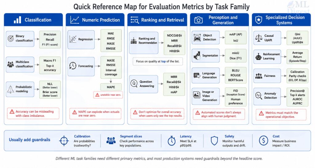
Before going deeper, a useful default is to report four views together:
- one primary task metric that matches the main user-facing objective
- one operating-point metric at the threshold, top-$k$, or alert capacity actually used in production
- one calibration or uncertainty metric when model scores are consumed as probabilities or confidence values
- one set of slice or guardrail checks across important segments, time windows, latency limits, or safety constraints
If you do only this, you are already much closer to a production-ready evaluation plan than teams that optimize a single headline score.
1. Why Evaluation Metrics Matter
Evaluation metrics answer four different questions:
- Is the model learning the task at all?
- Is the model good enough for deployment?
- Is the model improving compared with a baseline?
- Is the model optimizing what the business or product actually cares about?
The last question is where many projects fail. Teams often optimize a convenient offline metric rather than the true operational objective.
1.1 A simple mental model
Think of evaluation as using different lenses:
- A discrimination lens asks whether the model ranks correct answers above incorrect ones.
- A calibration lens asks whether predicted probabilities reflect reality.
- A cost lens asks whether mistakes are expensive in the same way.
- A robustness lens asks whether the model still works across segments, time, and data drift.
No single metric captures all four.
1.2 A visual way to picture metrics
Think of a production model as an instrument panel with multiple gauges. Each gauge corresponds to a different lens: discrimination, calibration, cost sensitivity, and robustness. A single green reading is not enough if the other gauges have not been checked.
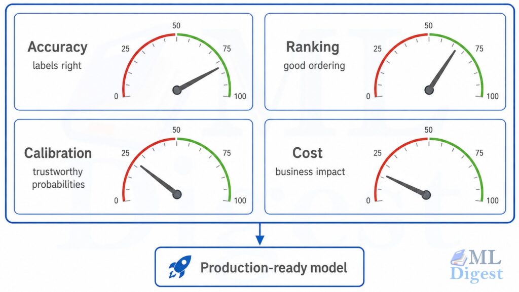
A strong production model usually needs several gauges in the safe zone, not just one.
2. Core Principles Before Choosing Any Metric
Before diving into task-specific metrics, a few principles apply almost everywhere.
2.1 Match the metric to the decision
If a model triggers an expensive human review, false positives matter. If a model filters cancer scans, false negatives may matter more. The metric must reflect that asymmetry.
2.2 Separate threshold-free and threshold-dependent metrics
- Threshold-free metrics evaluate ranking or probability quality without choosing a cutoff, such as ROC-AUC or log loss.
- Threshold-dependent metrics depend on a chosen decision threshold, such as precision, recall, or F1.
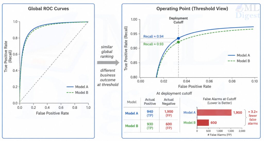
This distinction matters because a model can have a great ranking curve but poor performance at the threshold used in production.
2.3 Use a baseline
Metrics are meaningful relative to a reference:
- majority-class classifier
- seasonal naive forecaster
- current production model
- simple linear model
Without a baseline, even a good-looking score can be misleading.
2.4 Report uncertainty
An improvement from 0.812 to 0.817 may or may not matter. Confidence intervals, bootstrap estimates, or repeated cross-validation are often more informative than a single point estimate.
2.5 Use offline, online, and human evaluation together
Offline evaluation is where model development usually starts, but it is not where evaluation should end.
- Offline metrics tell you whether the model improved on held-out data.
- Online metrics tell you whether users or downstream systems actually benefited.
- Human evaluation tells you whether the behavior is acceptable when automatic metrics are incomplete.
For example, a recommender can improve NDCG@$10$ offline and still hurt retention if it becomes repetitive. A summarizer can improve ROUGE while becoming less factual. A medical classifier can improve ROC-AUC while becoming less calibrated at the threshold clinicians use.
The practical lesson is simple: use offline metrics for iteration speed, but validate important decisions with online or human-centered evidence.
2.6 Think in terms of operating points, not just model scores
Many teams compare models as if deployment were threshold-free. Deployment almost never is. In production, a model often needs a concrete rule:
- approve if score $> 0.9$
- alert if anomaly score is in the top 0.5%
- show the top 5 items
- escalate if predicted risk exceeds a cost-adjusted cutoff
This means two layers of evaluation matter:
- Model quality across all thresholds, measured by metrics such as ROC-AUC or Average Precision / PR-oriented summaries.
- Model quality at the chosen operating point, measured by precision, recall, cost, or business utility.
2.7 Evaluate the evaluation setup, not just the metric
A metric can be perfectly well chosen and still be misleading if the evaluation protocol is weak. In practice, many teams do not fail because they picked the wrong formula. They fail because they measured the right formula on the wrong data split.
Before trusting any reported score, check these questions:
- Does the validation split match deployment conditions, including time, geography, user population, and label availability?
- Is there leakage from future data (point-in-time correctness), duplicated examples, shared users, or preprocessing fit on the full dataset?
- Are labels trustworthy enough for the metric to mean what you think it means?
- Is the class prevalence or target distribution in evaluation close to the one the product will face?
- Are repeated experiments stable, or does the score move dramatically across random seeds or folds?
This is especially important in forecasting, recommender systems, medical ML, and any setting with user-level or time-dependent correlations. A random split can make a model look far better than it will behave after deployment.
This kind of split and protocol design is part of the broader machine learning project lifecycle, not just a reporting detail at the end.
3. Classification Metrics
Classification is the most familiar evaluation setting, but it is also where metric misuse is common.
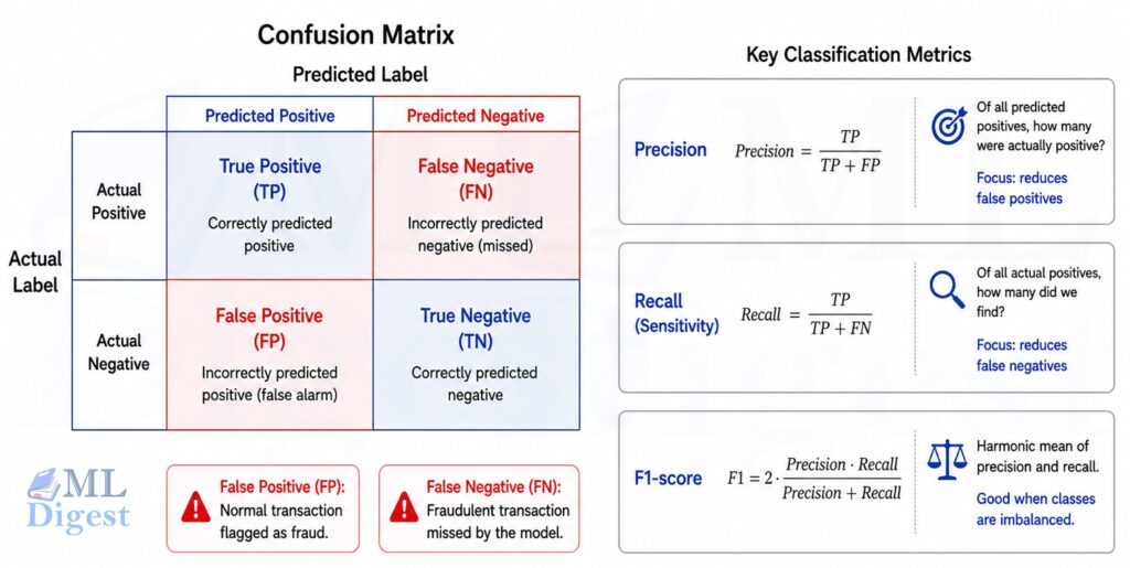
3.1 Confusion matrix foundation
For binary classification, the confusion matrix contains true positives (TP), true negatives (TN), false positives (FP), and false negatives (FN).
For example, in a fraud detection system: true positives are correctly flagged frauds, true negatives are correctly cleared transactions, false positives are legitimate transactions flagged as fraud, and false negatives are fraudulent transactions that slip through.
True positives and true negatives represent correct predictions, but the errors (false positives and false negatives) are where real-world cost concentrates. In most applications, these two error types carry different consequences, so many metrics are designed to capture the tradeoff between them.
Many classification metrics are simple transformations of these four counts.
3.2 Accuracy
It is the fraction of correct predictions among all predictions:
$$
\mathrm{Accuracy} = \frac{TP + TN}{TP + TN + FP + FN}
$$
The range is from 0 to 1, where 1 means all predictions are correct and 0 means all predictions are incorrect.
Strengths
- Very intuitive
- Useful when classes are balanced and error costs are similar
- Easy to explain to non-technical stakeholders
Weaknesses
- Misleading under class imbalance
- Hides whether errors are false positives or false negatives
- Ignores calibration and ranking quality
Use when
- Classes are reasonably balanced
- All mistakes carry roughly equal cost
- Accuracy is not the only reported metric
3.3 Precision
It is the fraction of true positives among all predicted positives:
$$
\mathrm{Precision} = \frac{TP}{TP + FP}
$$
It ranges from 0 to 1, where 1 means every predicted positive is correct (no false positives), and 0 means every predicted positive is incorrect (all false positives). Precision focuses on the correctness of positive predictions.
Strengths
- Good when false positives are costly
- Useful for alerting, search, moderation, and fraud review queues
Weaknesses
- Can look high when the model predicts very few positives
- Says nothing about missed positives
Use when
- You care about correctness of positive predictions
- Human review capacity is limited
3.4 Recall or sensitivity (true positive rate)
It measures the fraction of true positives among all actual positives:
$$
\mathrm{Recall} = \frac{TP}{TP + FN}
$$
Its range is from 0 to 1, where 1 means all actual positives are correctly identified (no false negatives), and 0 means no actual positives are identified (all false negatives). Recall focuses on the model’s ability to capture all positive cases.
Strengths
- Good when false negatives are costly
- Important in medical screening, anomaly detection, and safety systems
Weaknesses
- Can be inflated by predicting positive too often
- Must be interpreted with precision
Use when
- Missing a positive case is more harmful than investigating a false alarm
3.5 Specificity (true negative rate)
This metric measures the fraction of true negatives among all actual negatives:
$$
\mathrm{Specificity} = \frac{TN}{TN + FP}
$$
It ranges from 0 to 1, where 1 means all actual negatives are correctly identified (no false positives), and 0 means no actual negatives are identified (all false positives). Specificity focuses on the model’s ability to correctly identify negative cases.
Strengths
- Complements recall
- Important when false alarms are harmful
Weaknesses
- Less informative if negatives dominate heavily
Use when
- The ability to avoid false positives is important
- You need a balanced medical-style sensitivity-specificity view
3.6 F1 score
This is the harmonic mean of precision and recall:
$$
F_1 = 2 \cdot \frac{\text{Precision} \cdot \text{Recall}}{\text{Precision} + \text{Recall}}
$$
It ranges from 0 to 1, where 1 means perfect precision and recall, and 0 means either precision or recall is zero. The F1 score balances the tradeoff between precision and recall, giving a single metric that reflects both.
Strengths
- Useful for imbalanced classification
- Penalizes systems that perform well on only one of precision or recall
Weaknesses
- Ignores true negatives
- Assumes precision and recall matter equally
- Not ideal when costs are asymmetric
Use when
- Positive class matters most
- You need a single summary of precision-recall tradeoff
3.7 $F_\beta$ score
This generalizes F1 by introducing a weighting factor $\beta$ to control the emphasis on precision versus recall:
$$
F_\beta = (1 + \beta^2) \cdot \frac{\text{Precision} \cdot \text{Recall}}{\beta^2 \cdot \text{Precision} + \text{Recall}}
$$
- $\beta > 1$ emphasizes recall
- $\beta < 1$ emphasizes precision
It ranges from 0 to 1, where 1 means perfect precision and recall, and 0 means either precision or recall is zero. The $F_\beta$ score allows you to prioritize either precision or recall based on the specific costs of false positives and false negatives in your application.
Strengths
- More flexible than F1
- Lets the metric reflect domain costs
Weaknesses
- Choosing $\beta$ requires business reasoning
- Still ignores true negatives
Use when
- Precision and recall matter unequally
3.8 Balanced accuracy
This metric averages recall (sensitivity) and specificity:
$$
\mathrm{Balanced\ Accuracy} = \frac{\text{Recall} + \text{Specificity}}{2}
$$
It ranges from 0 to 1, where 1 means perfect recall and specificity, and 0 means either recall or specificity is zero. Balanced accuracy gives equal importance to both classes in binary settings.
Strengths
- Better than raw accuracy under imbalance
- Gives both classes equal importance
Weaknesses
- Still threshold-dependent
- Less expressive than full precision-recall analysis
Use when
- Class distribution is skewed and accuracy is misleading
3.9 Matthews correlation coefficient (MCC)
This metric combines all four confusion matrix values into a single correlation coefficient:
$$
\mathrm{MCC} = \frac{TP \cdot TN – FP \cdot FN}{\sqrt{(TP+FP)(TP+FN)(TN+FP)(TN+FN)}}
$$
It ranges from $-1$ to $1$, where $1$ means perfect prediction, $0$ means no better than random, and $-1$ means total disagreement between predictions and true labels. MCC gives a balanced measure even if the classes are of very different sizes.
Strengths
- Robust summary under imbalance
- Uses all four confusion matrix cells
- Often more informative than F1 when negative class matters too
Weaknesses
- Less intuitive for non-technical audiences
- Undefined in some degenerate cases unless handled carefully
Use when
- You want a single balanced metric for binary classification
- Both positive and negative classes matter
3.10 Cohen’s kappa
This metric measures agreement between two raters (e.g., model vs. human, or annotator A vs. annotator B) while adjusting for chance agreement:
$$
\kappa = \frac{p_o – p_e}{1 – p_e}
$$
where $p_o$ is observed agreement and $p_e$ is agreement expected by chance.
It ranges from $-1$ to $1$, where $1$ means perfect agreement, $0$ means agreement no better than chance, and $-1$ means total disagreement. Cohen’s kappa adjusts for the possibility of agreement occurring by chance.
Strengths
- Useful when random agreement matters
- Common in annotation quality and model-vs-human comparisons
Weaknesses
- Sensitive to prevalence and label marginals
- Harder to interpret than accuracy
Use when
- Comparing annotators or classifier agreement beyond chance
3.11 ROC curve and ROC-AUC
The ROC curve plots:
- TPR $= \frac{TP}{TP+FN}$
- FPR $= \frac{FP}{FP+TN}$
across all thresholds.
ROC-AUC is the area under this curve.
Intuition: if you randomly choose one positive and one negative example, ROC-AUC is the probability the model ranks the positive higher.
Strengths
- Threshold-free
- Useful for comparing ranking quality across models
- Stable when class priors shift moderately
Weaknesses
- Can look overly optimistic for highly imbalanced data
- Includes regions of the threshold space you may never use in practice
Use when
- You care about ranking quality
- You want a threshold-independent comparison
3.12 Precision-Recall curve, PR-AUC, and Average Precision
The PR curve plots precision against recall across thresholds.
PR-AUC usually means the geometric area under the precision-recall curve.
Average Precision (AP) is a closely related summary that weights precision by the increase in recall at each threshold. In many libraries, AP is reported instead of a trapezoidal PR-AUC, so the two are related but not always numerically identical.
Strengths
- Better than ROC-AUC for rare positive classes
- Focuses attention on the positive class
- More realistic for search, fraud, and retrieval-like classification
Weaknesses
- Baseline depends on prevalence, so scores are less directly comparable across datasets
- Can vary substantially with small positive counts
Use when
- Positive class is rare or operationally important
3.13 Log loss, cross-entropy loss
This metric evaluates the quality of predicted probabilities rather than just hard labels.
For binary classification:
$$
\mathrm{Log\ Loss} = -\frac{1}{N} \sum_{i=1}^{N} \left[y_i \log p_i + (1-y_i) \log (1-p_i)\right]
$$
For multiclass classification:
$$
\mathrm{Cross\text{-}Entropy} = -\frac{1}{N} \sum_{i=1}^{N} \sum_{k=1}^{K} y_{ik} \log p_{ik}
$$
It ranges from 0 to $\infty$, where 0 means perfect predictions (probabilities of 1 for true classes and 0 for others), and higher values indicate worse probability estimates. Log loss penalizes confident wrong predictions more heavily than less confident ones, making it a proper scoring rule that encourages honest probability estimates.
Strengths
- Uses full probability distribution, not just hard labels
- Strongly penalizes confident wrong predictions
- Proper scoring rule, so it encourages honest probability estimates
Weaknesses
- Harder to interpret than accuracy
- Sensitive to outliers and probability clipping issues
Use when
- Predicted probabilities drive decisions
- Calibration matters
3.14 Brier score
This metric measures the mean squared error of predicted probabilities:
For binary classification:
$$
\mathrm{Brier} = \frac{1}{N} \sum_{i=1}^{N} (p_i – y_i)^2
$$
It ranges from 0 to 1, where 0 means perfect predictions (probabilities of 1 for positives and 0 for negatives), and 1 means completely wrong predictions (probabilities of 0 for positives and 1 for negatives). The Brier score captures both calibration and discrimination aspects of probability estimates.
Strengths
- Interpretable probability error
- Proper scoring rule
- Often easier to reason about than log loss
Weaknesses
- Penalizes errors less aggressively than log loss for confident mistakes
- Less common in dashboards
Use when
- Calibration and probability quality are important
- You want a probability-centric metric with bounded scale
3.15 Calibration metrics: ECE and MCE
This family of metrics evaluates how well predicted probabilities match observed frequencies.
Expected Calibration Error (ECE) bins predictions by confidence:
$$
\mathrm{ECE} = \sum_{m=1}^{M} \frac{|B_m|}{N} \left|\text{acc}(B_m) – \text{conf}(B_m)\right|
$$
where $B_m$ is a confidence bin.
Maximum Calibration Error (MCE) uses the maximum absolute bin gap instead of the weighted average.
It ranges from 0 to 1, where 0 means perfect calibration (predicted probabilities match observed frequencies in each bin), and higher values indicate worse calibration. ECE and MCE provide insights into how well the model’s confidence estimates align with actual outcomes.
Strengths
- Directly measures trustworthiness of predicted probabilities
- Useful in risk-sensitive systems
Weaknesses
- Depends on binning scheme
- Can hide local calibration issues or exaggerate them depending on sample size
Use when
- Decisions depend on predicted confidence values
- You are comparing calibration methods such as Platt scaling or isotonic regression
For a comprehensive guide to diagnosing and correcting miscalibration, see Model Calibration.
3.16 Top-$k$ accuracy
This metric evaluates whether the true class label is among the top $k$ predicted labels:
$$
\mathrm{TopAcc}k = \frac{1}{N} \sum{i=1}^{N} \mathbf{1}{y_i \in \text{top-}k\text{ predicted labels}}
$$
It ranges from 0 to 1, where 1 means the true label is always among the top $k$ predictions, and 0 means it is never among them. Top-$k$ accuracy is particularly useful in multiclass classification problems where the model may be allowed to make multiple guesses.
Strengths
- Very useful in large-label problems such as image classification and recommendation candidates
Weaknesses
- Ignores calibration
- Less meaningful if end users only see one prediction
Use when
- Downstream systems or users consider multiple candidates
3.17 Multiclass and multilabel averaging
When a dataset has more than two classes, metrics are often reported using different averaging strategies:
- Macro average: Compute the metric independently for each class (treating each class as the positive class in turn), then take the unweighted mean of these per-class values. This treats all classes equally, regardless of how many samples each class has.
- Micro average: Aggregate the true positives, false positives, false negatives, and true negatives across all classes, then compute the metric from these global totals. This approach gives more influence to classes with more samples and is equivalent to computing the metric on the entire dataset without regard to class labels.
- Weighted average: Like macro, but each class’s metric is weighted by its frequency (number of true instances), so common classes contribute more to the final score.
Best practice: Macro averages highlight performance on minority classes, while micro averages reflect overall accuracy dominated by common classes. Report both when class frequencies are imbalanced to give a fuller picture of model performance.
3.18 KS statistic and lift-oriented evaluation
In credit risk, marketing response modeling, and some fraud systems, teams often care about how sharply a model separates positives from negatives near the top of the score distribution.
One common metric is the Kolmogorov-Smirnov statistic (KS statistic):
$$
KS = \max_t \left[TPR(t) – FPR(t)\right]
$$
where $t$ ranges over thresholds.
What it measures: the maximum vertical separation between the cumulative positive and negative score distributions.
Strengths
- Easy to interpret as separability
- Popular in scorecard and risk-model evaluation
- Useful for threshold selection diagnostics
Weaknesses
- Does not evaluate probability calibration
- Less standard outside risk and response-modeling domains
Use when
- You are evaluating score-based ranking in regulated or business-risk settings
Related tools such as lift, gain charts, and capture rate in the top decile are also useful when the workflow is explicitly capacity-constrained. For example, if an investigation team can only inspect the top 2% of cases, then performance inside that slice is often more informative than full-range AUC.
4. Regression Metrics
Regression metrics quantify distance between predicted and actual numeric values.
4.1 Mean Absolute Error (MAE)
This metric computes the average absolute difference between predicted and actual values:
$$
\mathrm{MAE} = \frac{1}{N}\sum_{i=1}^{N} |y_i – \hat{y}_i|
$$
It ranges from 0 to $\infty$, where 0 means perfect predictions (no error), and higher values indicate worse performance. MAE gives an intuitive measure of average error in the same units as the target variable.
Strengths
- Easy to interpret in original units
- Robust relative to MSE when outliers exist
Weaknesses
- Not differentiable at zero error, though this matters more for optimization than evaluation
- Does not penalize large errors aggressively
Use when
- All errors matter linearly
- Interpretability in natural units matters
4.2 Mean Squared Error (MSE)
This metric computes the average of the squared differences between predicted and actual values:
$$
\mathrm{MSE} = \frac{1}{N}\sum_{i=1}^{N}(y_i – \hat{y}_i)^2
$$
It ranges from 0 to $\infty$, where 0 means perfect predictions (no error), and higher values indicate worse performance. MSE strongly penalizes large errors due to the squaring term, making it sensitive to outliers.
Strengths
- Strongly penalizes large errors
- Common in optimization and statistical modeling
Weaknesses
- Sensitive to outliers
- Reported in squared units, which are less interpretable
Use when
- Large misses should be punished heavily
- Squared-error assumptions make sense
4.3 Root Mean Squared Error (RMSE)
This metric is the square root of MSE, bringing the error back to the original unit scale:
$$
\mathrm{RMSE} = \sqrt{\frac{1}{N}\sum_{i=1}^{N}(y_i – \hat{y}_i)^2}
$$
It ranges from 0 to $\infty$, where 0 means perfect predictions (no error), and higher values indicate worse performance. RMSE is useful when you want to penalize large errors more heavily while keeping the error in the original unit scale.
Strengths
- Interpretable in original units
- Still penalizes large errors more than MAE
Weaknesses
- Sensitive to outliers
Use when
- Large errors should matter more, but you want unit-scale interpretability
4.4 Median Absolute Error
This metric computes the median of the absolute differences between predicted and actual values:
$$
\mathrm{MedAE} = \text{median}(|y_i – \hat{y}_i|)
$$
It ranges from 0 to $\infty$, where 0 means perfect predictions (no error), and higher values indicate worse performance. MedAE is very robust to outliers, making it useful when a few extreme cases should not dominate evaluation.
Strengths
- Very robust to outliers
- Useful when a few extreme cases should not dominate evaluation
Weaknesses
- Ignores tail behavior too strongly in some applications
Use when
- Error robustness is more important than tail sensitivity
4.5 Mean Absolute Percentage Error (MAPE)
This metric computes the average absolute percentage difference between predicted and actual values:
$$
\mathrm{MAPE} = \frac{100}{N}\sum_{i=1}^{N} \left|\frac{y_i – \hat{y}_i}{y_i}\right|
$$
It ranges from 0 to $\infty$, where 0 means perfect predictions (no error), and higher values indicate worse performance. MAPE expresses error as a percentage of the actual value, making it easy to interpret in terms of relative error.
Strengths
- Expressed as a percentage
- Easy for business stakeholders to understand
Weaknesses
- Undefined or unstable when $y_i=0$ or near zero
- Penalizes over and under forecasting asymmetrically
- Can bias model selection toward underprediction
Use when
- Targets are strictly positive and not close to zero
- Percentage error is meaningful in the domain
4.6 Symmetric MAPE (sMAPE)
This metric attempts to address some of MAPE’s issues by using the average of actual and predicted values in the denominator:
$$
\mathrm{sMAPE} = \frac{100}{N}\sum_{i=1}^{N} \frac{|y_i – \hat{y}_i|}{(|y_i| + |\hat{y}_i|)/2}
$$
It ranges from 0 to 200%, where 0% means perfect predictions (no error), and higher values indicate worse performance. sMAPE is designed to be more symmetric in penalizing over- and under-predictions, but it still has issues near zero.
Strengths
- Attempts to reduce some MAPE asymmetry
- Often used in forecasting competitions and business reporting
Weaknesses
- Still behaves oddly near zero
- Interpretation is less intuitive than it first appears: the metric is bounded at 200% rather than 100%, and asymmetric behavior can re-emerge when either the actual or predicted value is near zero
Use when
- You need a percentage-like forecasting metric and understand its quirks
4.7 Mean Absolute Scaled Error (MASE)
This metric scales the mean absolute error by the mean absolute error of a naive baseline forecast, often the seasonal naive forecast for time series data:
$$
\mathrm{MASE} = \frac{\frac{1}{N}\sum_{t=1}^{N}|e_t|}{\frac{1}{N-m}\sum_{t=m+1}^{N}|y_t – y_{t-m}|}
$$
where $m$ is the seasonal period and the denominator is typically computed from an in-sample naive or seasonal-naive baseline on the training series.
The main reason practitioners like MASE is that it scales error by a baseline forecast rather than by the raw target value. That makes it much more stable than percentage metrics when you compare many series with different magnitudes or occasional zeros.
It ranges from 0 to $\infty$, where 0 means perfect predictions (no error), and higher values indicate worse performance. A MASE of less than 1 indicates that the model is performing better than the naive baseline, while a MASE greater than 1 indicates worse performance.
Strengths
- Scale-free and comparable across series
- More stable than MAPE when zeros occur
- Useful in time-series forecasting
Weaknesses
- Requires a meaningful naive baseline
- Less intuitive for casual stakeholders
Use when
- Comparing forecast models across multiple time series
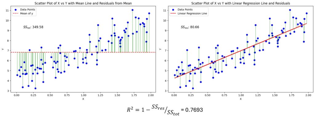
4.8 $R^2$ coefficient of determination
This metric measures the proportion of variance in the target variable that is explained by the model:
$$
R^2 = 1 – \frac{\sum_i (y_i – \hat{y}_i)^2}{\sum_i (y_i – \bar{y})^2}
$$
It ranges from $-\infty$ to 1, where 1 means perfect predictions (all variance explained), 0 means the model is no better than predicting the mean, and negative values indicate the model is worse than predicting the mean. $R^2$ is a relative measure of fit compared to a simple baseline.
Strengths
- Popular and familiar
- Useful for comparing models on the same dataset
Weaknesses
- Can be negative on test data
- Says little about calibration of absolute errors
- High $R^2$ does not necessarily mean practically useful predictions
Use when
- You need a relative goodness-of-fit measure on the same target distribution
For a practical deep dive into interpreting $R^2$ and its common pitfalls, see $R^2$: The Goodness of Fit Metric.
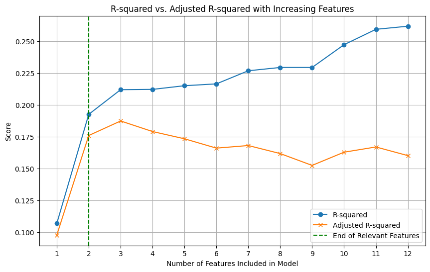
4.9 Adjusted $R^2$
This metric adjusts $R^2$ for the number of predictors in a linear regression model, penalizing the addition of features that do not improve fit:
$$
\mathrm{Adjusted}\ R^2 = 1 – (1-R^2)\frac{n-1}{n-p-1}
$$
where $p$ is the number of predictors.
It ranges from $-\infty$ to 1. Adjusted $R^2$ is designed to provide a more honest estimate of model performance by accounting for the number of features.
Strengths
- Penalizes adding weak features in linear models
Weaknesses
- Mostly useful in classical regression settings
- Not a general-purpose ML selection metric
Use when
- Comparing nested linear regression models
For the nuances and practical limits of adjusted $R^2$ in ML settings, see Adjusted R-Squared.
4.10 Huber loss as an evaluation metric
This metric combines the best of MAE and MSE by being quadratic for small errors and linear for large errors:
$$
L_\delta(a) =
\begin{cases}
\frac{1}{2}a^2 & |a| \le \delta \
\delta(|a| – \frac{1}{2}\delta) & |a| > \delta
\end{cases}
$$
where $a = y – \hat{y}$.
It ranges from 0 to $\infty$, where 0 means perfect predictions (no error), and higher values indicate worse performance. Huber loss is less sensitive to outliers than MSE while still being differentiable, making it a popular choice for regression problems with potential outliers.
Strengths
- Combines MSE-like sensitivity near zero with MAE-like robustness for large errors
Weaknesses
- Requires choosing $\delta$
- Less intuitive for reporting
Use when
- You want partial robustness to outliers without ignoring large errors entirely
4.11 Mean Squared Log Error (MSLE) and RMSLE
These metrics compute the mean squared error of the logarithm of predicted and actual values, often with a shift to handle zeros:
$$
\mathrm{MSLE} = \frac{1}{N}\sum_{i=1}^{N} \left(\log(1+y_i) – \log(1+\hat{y}_i)\right)^2
$$
and
$$
\mathrm{RMSLE} = \sqrt{\mathrm{MSLE}}
$$
It ranges from 0 to $\infty$, where 0 means perfect predictions (no error), and higher values indicate worse performance. MSLE and RMSLE are useful when the target variable is right-skewed and you care more about relative errors than absolute errors.
Strengths
- Useful when relative error matters more than absolute error
- Reduces the dominance of very large target values
- Common in demand, price, and count-like prediction problems
Weaknesses
- Requires non-negative targets in its standard form
- Less suitable when errors near zero carry major business cost
Use when
- The target is right-skewed and percentage-like miss size matters more than raw unit error
4.12 Pinball loss for quantile regression
When the model predicts a quantile rather than a mean, the usual MAE and RMSE are not the right objective. The pinball loss (also called quantile loss) is the correct metric for evaluating quantile forecasts.
For quantile level $\tau \in (0,1)$:
$$
L_\tau(y, \hat{y}) =
\begin{cases}
\tau (y-\hat{y}) & y \ge \hat{y} \
(1-\tau)(\hat{y}-y) & y < \hat{y}
\end{cases}
$$
It ranges from 0 to $\infty$, where 0 means perfect predictions (the predicted quantile matches the actual value), and higher values indicate worse performance. The pinball loss penalizes underestimation and overestimation asymmetrically based on the quantile level $\tau$.
Strengths
- Correct metric for quantile forecasts such as p50, p90, or p95 latency
- Lets you express asymmetric business tolerance for underprediction and overprediction
Weaknesses
- Less intuitive than MAE or RMSE for general audiences
- Different quantiles require separate interpretation
Use when
- Predicting service-level buffers, risk bounds, or uncertainty-aware point estimates
5. Forecasting Metrics
Forecasting is regression over time, but time adds extra structure and pitfalls. A grounding in time-series forecasting fundamentals, including stationarity, seasonality, and trend decomposition, shapes which metrics are appropriate for a given problem.
5.1 Weighted Absolute Percentage Error (WAPE)
This metric is a variant of MAPE that weights errors by the actual values, making it more stable when comparing across series with different scales or occasional zeros:
$$
\mathrm{WAPE} = \frac{\sum_i |y_i – \hat{y}_i|}{\sum_i |y_i|}
$$
It ranges from 0 to $\infty$, where 0 means perfect predictions (no error), and higher values indicate worse performance. WAPE is often used in supply chain and demand forecasting contexts where comparing across many series with different volumes is common.
Strengths
- Stable aggregate percentage-like measure
- Useful in supply chain and demand forecasting
Weaknesses
- Can hide poor performance on low-volume series
- Still depends on target scale composition
Use when
- Aggregate forecasting quality matters more than per-item fairness
5.2 Root Mean Squared Scaled Error (RMSSE)
RMSSE scales squared errors by an in-sample naive or seasonal-naive forecasting baseline, analogous to MASE but with squared loss.
$$
\mathrm{RMSSE} = \sqrt{\frac{\frac{1}{N}\sum e_t^2}{\frac{1}{N-m}\sum (y_t – y_{t-m})^2}}
$$
It ranges from 0 to $\infty$, where 0 means perfect predictions (no error), and higher values indicate worse performance. RMSSE is useful for comparing forecast accuracy across series with different scales and seasonal patterns.
Strengths
- Useful for forecast competitions and multi-series comparison
- Penalizes large misses more strongly than MASE
Weaknesses
- Sensitive to spikes and outliers
Use when
- Large forecast misses have disproportionate cost
5.3 Prediction interval coverage probability (PICP)
If a model predicts intervals $[L_i, U_i]$, then
$$
\mathrm{PICP} = \frac{1}{N}\sum_{i=1}^{N} \mathbf{1}{y_i \in [L_i, U_i]}
$$
It ranges from 0 to 1, where 1 means all true values fall within the predicted intervals, and 0 means none do. PICP measures the calibration of uncertainty intervals by checking how often they contain the true outcomes.
Strengths
- Measures whether uncertainty intervals capture true outcomes at the claimed rate
Weaknesses
- Can be gamed by making intervals too wide
Use when
- Evaluating probabilistic forecasts, not just point forecasts
5.4 Interval width and Winkler score
Prediction intervals must be both accurate and sharp. A narrow correct interval is better than a wide uninformative one.
The Winkler score (also called the interval score) combines interval width with penalties when the truth falls outside the interval. For a central $(1-\alpha)$ prediction interval $[l, u]$:
$$
W_\alpha(l, u; y) = (u – l) + \frac{2}{\alpha}(l – y)\cdot\mathbf{1}{y < l} + \frac{2}{\alpha}(y – u)\cdot\mathbf{1}{y > u}
$$
The first term rewards narrow intervals, while the penalty terms increase sharply (scaled by $1/\alpha$) whenever the observation falls outside the interval.
It ranges from 0 to $\infty$, where 0 means perfect predictions (narrow intervals that always contain the true value), and higher values indicate worse performance. The Winkler score encourages both calibration and sharpness in interval forecasts.
Strengths
- Balances calibration and sharpness
Weaknesses
- Less familiar than point-error metrics
Use when
- Uncertainty quality matters operationally
6. Ranking, Retrieval, Search, and Recommendation Metrics
Many industrial ML systems do not make a single prediction. They rank a list. Recommendation systems are the canonical example, combining retrieval, ranking, and personalization into a single pipeline where metric choice is especially consequential.
6.1 Precision@$k$
This calculates the fraction of the top $k$ recommended items that are relevant:
$$
\mathrm{Precision@}k = \frac{\text{# relevant items in top } k}{k}
$$
For $N$ recommendation sessions, you can average this metric across sessions. That is,
$$
\mathrm{Precision@}k = \frac{1}{N} \sum_{i=1}^{N} \frac{\text{# relevant items in top } k_i}{k}
$$
It ranges from 0 to 1, where 1 means all top $k$ recommendations are relevant, and 0 means none are. Precision@$k$ focuses on the relevance of the top-ranked items, which is often what users interact with.
Strengths
- Easy to interpret
- Useful when only top results matter
Weaknesses
- Ignores relevant items below rank $k$
- Does not reward correct ordering within the top $k$
Use when
- Users consume only a small number of results
6.2 Recall@$k$
This calculates the fraction of all relevant items that appear in the top $k$ recommendations:
$$
\mathrm{Recall@}k = \frac{1}{N} \sum_{i=1}^{N} \frac{\text{# relevant items in top } k_i}{\text{# relevant items total}(R_i)}
$$
It ranges from 0 to 1, where 1 means all relevant items are in the top $k$ recommendations, and 0 means none are. Recall@$k$ measures how well the system retrieves relevant items within the top $k$ positions.
Strengths
- Measures coverage of relevant items
Weaknesses
- Can favor long recommendation lists
- Requires knowing all relevant items, which is often difficult
Use when
- Missing relevant items is costly
6.3 Hit Rate@$k$
This is a binary metric that checks if at least one relevant item appears in the top $k$ recommendations:
$$
\mathrm{HitRate@}k = \frac{1}{N} \sum_{i=1}^{N} \mathbf{1}{\text{at least one relevant item appears in top } k}
$$
where $N$ is the number of recommendation sessions.
It ranges from 0 to 1, where 1 means every session has at least one relevant item in the top $k$ recommendations, and 0 means no sessions do. Hit Rate@$k$ is a coarse metric that focuses on whether the system can provide at least one good recommendation.
Strengths
- Simple session-level success metric
Weaknesses
- Ignores how many relevant items were retrieved
- Ignores ranking order within top $k$
Use when
- You only need one good recommendation to satisfy the user
6.4 Mean Reciprocal Rank (MRR)
This metric focuses on the rank of the first relevant item:
$$
\mathrm{MRR} = \frac{1}{N}\sum_{i=1}^{N} \frac{1}{\text{rank}_i}
$$
where $\text{rank}_i$ is the rank of the first relevant item.
It ranges from 0 to 1, where 1 means the first relevant item is always at rank 1, and values close to 0 indicate that relevant items are often ranked very low or not at all. MRR emphasizes the importance of placing the first relevant item as high as possible in the ranking.
Strengths
- Strongly rewards placing the first relevant item early
- Good for question answering, autocomplete, and search
Weaknesses
- Considers only the first relevant item
Use when
- The first good result dominates user experience
6.5 Average Precision (AP) and Mean Average Precision (mAP)
This metric summarizes the precision-recall curve by averaging precision at the ranks where relevant items appear. For one query:
$$
\mathrm{AP} = \frac{1}{R}\sum_{k=1}^{n} P(k) \cdot \text{rel}(k)
$$
where $R$ is the number of relevant items, $P(k)$ is precision at rank $k$, and $\text{rel}(k)$ is 1 if the item at rank $k$ is relevant.
Then:
$$
\mathrm{mAP} = \frac{1}{Q}\sum_{q=1}^{Q} AP_q
$$
It ranges from 0 to 1, where 1 means all relevant items are ranked at the top for all queries, and 0 means none are. mAP provides a comprehensive measure of ranking quality across multiple queries.
Strengths
- Rewards ranking relevant items early
- Standard for retrieval and detection benchmarks
Weaknesses
- Harder to explain than precision@$k$
- Depends on complete relevance judgments
Use when
- You want a robust ranking summary across queries
6.6 Normalized Discounted Cumulative Gain (NDCG)
This metric handles graded relevance and discounts items based on their rank position. For a single query:
$$
\mathrm{DCG@}k = \sum_{i=1}^{k} \frac{2^{rel_i} – 1}{\log_2(i+1)}
$$
$$
\mathrm{NDCG@}k = \frac{\text{DCG@}k}{\text{IDCG@}k}
$$
where $rel_i$ is the relevance of the item at rank $i$, and IDCG is the ideal DCG obtained by sorting items by relevance.
It ranges from 0 to 1, where 1 means the ranking is perfect with all relevant items at the top, and values close to 0 indicate poor ranking quality. NDCG is particularly useful when relevance is not binary and when the position of relevant items significantly impacts user satisfaction.
Strengths
- Handles multiple relevance levels
- Rewards top-of-list ordering
- Common in search and recommender evaluation
Weaknesses
- Requires graded labels
- Less intuitive than hit rate or precision@$k$
Use when
- Relevance is not binary and position matters strongly
6.7 AUC for ranking
ROC-AUC can also be interpreted as a pairwise ranking metric. It measures the probability that a randomly chosen relevant item is ranked higher than a randomly chosen non-relevant item.
Strengths
- Useful for implicit feedback ranking and CTR prediction
Weaknesses
- Does not focus enough on the top of the ranking where product impact often lives
Use when
- Global ranking quality matters, not just top-$k$
6.8 Catalog coverage, diversity, novelty, serendipity
These are not pure relevance metrics, but they are essential in recommendation systems.
- Coverage: fraction of items that ever get recommended
- Diversity: dissimilarity among recommended items
- Novelty: tendency to recommend less obvious items
- Serendipity: useful but unexpected recommendations
Strengths
- Capture user experience beyond raw relevance
Weaknesses
- Often harder to define and validate offline
Use when
- Optimizing long-term marketplace or engagement health, not just click-through
7. Clustering Metrics
Clustering evaluation depends on whether ground-truth labels exist. An overview of clustering methods can help clarify which metric family is relevant for a given grouping approach.
7.1 Silhouette score
This is an internal metric that evaluates how well samples are clustered based on their distances to other samples.
For sample $i$:
$$
s(i) = \frac{b(i) – a(i)}{\max(a(i), b(i))}
$$
where $a(i)$ is mean intra-cluster distance and $b(i)$ is mean nearest-cluster distance.
It ranges from -1 to 1, where 1 means the sample is well clustered, 0 means it is on the boundary between clusters, and negative values mean it may be in the wrong cluster. The overall silhouette score is the average of $s(i)$ across all samples.
Strengths
- Measures cohesion and separation
- No ground-truth labels required
Weaknesses
- Sensitive to distance metric choice
- Less meaningful for irregular cluster shapes
Use when
- You need an internal clustering quality measure
7.2 Davies-Bouldin index
This metric evaluates clustering quality based on the ratio of within-cluster scatter to between-cluster separation. For each cluster, it finds the neighboring cluster that produces the worst-case (highest) ratio of combined scatter to centroid distance, then averages these worst-case ratios across all clusters. Lower values indicate better-separated, more compact clusters.
Strengths
- No labels required
- Useful for comparing cluster counts
Weaknesses
- Can favor spherical clusters
Use when
- You need a compactness-separation tradeoff metric
7.3 Calinski-Harabasz index
This is the ratio of between-cluster dispersion to within-cluster dispersion, adjusted for the number of clusters and total sample count. A higher ratio means clusters are both well separated and internally compact. Higher values indicate better clustering.
Strengths
- Fast and widely implemented
Weaknesses
- Often prefers larger numbers of clusters in some settings
Use when
- Comparing clustering configurations quickly
7.4 Adjusted Rand Index (ARI)
This is an external metric that compares a clustering against ground-truth labels, adjusting for chance agreement. It ranges from -1 to 1, where 1 means perfect agreement and 0 means random labeling.
Strengths
- Good when ground-truth labels exist
- Chance-corrected
Weaknesses
- Less intuitive than plain agreement
Use when
- Benchmarking clustering against known labels
7.5 Normalized Mutual Information (NMI)
This metric measures the mutual information between the cluster assignments and the true labels, normalized to be between 0 and 1. Higher values indicate better agreement.
One common normalization is:
$$
\mathrm{NMI}(Y, C) = \frac{2I(Y;C)}{H(Y) + H(C)}
$$
where $I$ is mutual information and $H$ is entropy. Different libraries also use other normalization conventions, so exact numeric values can differ slightly across implementations.
Strengths
- Measures label-cluster dependency
- Invariant to label permutation
Weaknesses
- Can be less sensitive to certain structural differences than ARI
Use when
- Comparing discovered clusters with known classes
7.6 Trustworthiness for dimensionality reduction and embedding evaluation
Not every unsupervised model produces clusters. Some produce a low-dimensional representation, such as PCA, UMAP, t-SNE, or learned embeddings. In those settings, a useful question is whether neighborhood structure is preserved.
One common metric is trustworthiness, which penalizes points that become artificial neighbors after projection.
For neighborhood size $k$:
$$
T(k) = 1 – \frac{2}{nk(2n-3k-1)} \sum_{i=1}^{n} \sum_{j \in U_i^{(k)}} (r(i,j)-k)
$$
where $U_i^{(k)}$ are points that appear among the projected $k$-nearest neighbors of point $i$ but were not among its original neighbors, and $r(i,j)$ is the original-space rank of point $j$ relative to point $i$.
It ranges from 0 to 1, where 1 means local neighborhoods are preserved perfectly after projection and values closer to 0 indicate stronger neighborhood distortion. Higher is better.
Strengths
- Useful for evaluating manifold learning and embedding quality
- Measures local neighborhood preservation directly
Weaknesses
- Focuses on local structure, not global geometry
- Depends on the choice of neighborhood size $k$
Use when
- Evaluating dimensionality reduction, semantic embeddings, or retrieval-oriented representation learning
8. Object Detection Metrics
Object detection must answer both what and where.
8.1 Intersection over Union (IoU)
This is the standard metric for measuring localization quality of predicted bounding boxes against ground-truth boxes. It is defined as the area of overlap between the predicted and true boxes divided by the area of their union:
$$
\mathrm{IoU} = \frac{\text{Area of Overlap}}{\text{Area of Union}}
$$
It measures how much the predicted region overlaps the true region. The range is from 0 to 1, where 1 means perfect overlap and 0 means no overlap. Higher is better.
Strengths
- Simple localization overlap metric
- Standard for matching predicted and true boxes
Weaknesses
- Does not by itself measure ranking or confidence quality
- Sensitive to small localization shifts for tiny objects
Use when
- Deciding whether a predicted box counts as correct
8.2 Average Precision at IoU thresholds
Detection benchmarks often compute AP at a fixed IoU threshold, such as AP@0.5, or averaged across thresholds, such as COCO-style AP@[0.5:0.95].
This metric measures ranking quality for detections while enforcing a minimum localization quality through the IoU threshold. AP ranges from 0 to 1, where 1 means the detector ranks correct matches perfectly with strong precision and recall. Higher is better.
Strengths
- Captures both detection confidence ranking and localization quality
- Industry standard for detectors
Weaknesses
- Harder to interpret operationally than precision or recall alone
- Sensitive to annotation noise
Use when
- Comparing detection models on standard benchmarks
8.3 Mean Average Precision for detection
Detection mAP averages AP over classes and sometimes IoU thresholds.
It measures overall detection quality across categories, and in some benchmarks across localization strictness levels as well. In standard reporting, mAP ranges from 0 to 1, where higher values indicate better overall detection performance. Higher is better.
Strengths
- Strong benchmark summary across many categories
Weaknesses
- Can hide poor performance on rare classes or small objects
Use when
- You need a standard single-number detector comparison
9. Image Segmentation Metrics
Segmentation predicts a label per pixel or per region.
9.1 Pixel accuracy
This is the fraction of pixels that are correctly classified:
$$
\mathrm{Pixel\ Accuracy} = \frac{\text{Correctly predicted pixels}}{\text{Total pixels}}
$$
It measures overall per-pixel correctness. The range is from 0 to 1, where 1 means every pixel label is correct and 0 means none are. Higher is better.
Strengths
- Very intuitive
Weaknesses
- Misleading when background dominates
Use when
- Classes are not severely imbalanced across pixels
9.2 Mean IoU (mIoU)
This computes the IoU for each class separately, treating that class as the positive class and all others as negative, then averages across classes.
For each class $c$:
$$
\mathrm{IoU}_c = \frac{TP_c}{TP_c + FP_c + FN_c}
$$
So, $\mathrm{mIoU} = \frac{1}{C} \sum_{c=1}^{C} \mathrm{IoU}_c$.
It measures average class-wise overlap between predicted and true segmentation masks. The range is from 0 to 1, where 1 means perfect segmentation for every class and 0 means no overlap. Higher is better.
Strengths
- Standard segmentation metric
- Better than pixel accuracy under imbalance
Weaknesses
- Can still be harsh for thin structures or boundary ambiguity
Use when
- Benchmarking semantic segmentation quality
9.3 Dice coefficient, F1 for sets
The Dice coefficient (also called the Sørensen-Dice coefficient) is a set-overlap metric closely related to IoU. The two are monotonically related: $\mathrm{Dice} = 2 \cdot \mathrm{IoU} / (1 + \mathrm{IoU})$, so they always agree on which prediction is better. In practice, Dice scores are numerically higher than IoU scores for the same overlap because the intersection is counted twice in the numerator:
$$
\mathrm{Dice} = \frac{2|A \cap B|}{|A| + |B|}
$$
Equivalent to F1 on pixel sets.
It measures overlap between predicted and true foreground regions. The range is from 0 to 1, where 1 means perfect overlap and 0 means no overlap. Higher is better.
Strengths
- Common in medical imaging
- Handles overlap in small positive regions well
Weaknesses
- Less sensitive than IoU in some regimes
Use when
- Foreground objects are small relative to background
9.4 Boundary F-score
This measures how well predicted boundaries align with ground-truth boundaries.
It focuses on contour quality rather than interior region overlap. The range is usually from 0 to 1, where 1 means the predicted boundaries align perfectly with the true boundaries. Higher is better.
Strengths
- Useful when edge quality matters more than bulk region overlap
Weaknesses
- Requires careful boundary tolerance design
Use when
- Autonomous driving lanes, medical contours, or precise outline tasks matter
9.5 Panoptic Quality (PQ)
For panoptic segmentation, the system must both classify regions and separate object instances correctly. A widely used summary metric is Panoptic Quality:
$$
PQ = \frac{\sum_{(p,g) \in TP} \mathrm{IoU}(p,g)}{|TP| + \frac{1}{2}|FP| + \frac{1}{2}|FN|}
$$
What it measures: combined quality of recognition and segmentation for matched predicted-instance and ground-truth-instance pairs.
Its range is from 0 to 1, where 1 means perfect recognition and mask quality for all instances. Higher is better.
Strengths
- Captures both detection and mask quality in one metric
- Useful for modern scene-understanding systems
Weaknesses
- More complex than plain IoU or Dice
- Harder to debug from the final score alone
Use when
- Evaluating panoptic segmentation or unified scene parsing systems
10. Generative Modeling and Language Metrics
Generative systems are difficult because exact wording overlap often misses real quality. For an overview of how these evaluation challenges manifest specifically in large language models, see How to Measure the Performance of LLMs.
It helps to separate four different evaluation goals in this section: intrinsic likelihood, reference-based overlap, task success, and human or model-judge preference. A metric that is useful for one of those goals is often weak for the others, which is why generative evaluation almost always needs a bundle rather than a single headline score.
10.1 Perplexity
This measures how surprised a language model is by the observed tokens, based on the average negative log-likelihood per token. For a sequence of $N$ tokens with probabilities $p(x_i)$:
$$
\mathrm{Perplexity} = \exp\left(-\frac{1}{N}\sum_{i=1}^{N}\log p(x_i)\right)
$$
The range of perplexity is $[1, \infty)$, where 1 means the model perfectly predicts the text (assigning probability 1 to each token), and higher values indicate more surprise.
Strengths
- Standard intrinsic language modeling metric
- Useful during training and model comparison on the same tokenizer and dataset
Weaknesses
- Not directly aligned with human preference or factuality
- Not comparable across different tokenizers or vocabulary sizes, making cross-model perplexity comparisons unreliable even on the same text
Use when
- Evaluating next-token language models intrinsically
For a standalone treatment of how perplexity is computed and what it reveals, see Perplexity.
10.2 BLEU
BLEU measures modified n-gram precision with a brevity penalty.
$$
\mathrm{BLEU} = BP \cdot \exp\left(\sum_{n=1}^{N} w_n \log p_n\right)
$$
where $p_n$ is the modified n-gram precision, $w_n$ are weights (often uniform), and $BP$ is a brevity penalty that penalizes short outputs.
It measures surface-form overlap with one or more reference texts while penalizing outputs that are too short. In common normalized implementations, it ranges from 0 to 1, where higher values indicate greater n-gram overlap after the brevity penalty is applied. Higher is better.
Strengths
- Fast, reproducible, widely used in translation
Weaknesses
- Overemphasizes surface overlap
- Misses meaning preservation, fluency nuances, and factuality
Use when
- You need a legacy machine translation benchmark metric, but not as the only metric
10.3 ROUGE
ROUGE variants measure overlap between generated and reference summaries.
- ROUGE-N: n-gram overlap recall
- ROUGE-L: longest common subsequence overlap
It ranges from 0 to 1, with higher values indicating more overlap with the reference summary. ROUGE is commonly used in summarization evaluation, where recall of reference content is often more important than precision.
Strengths
- Common in summarization evaluation
Weaknesses
- Rewards wording overlap more than faithfulness or usefulness
Use when
- Comparing systems against fixed references in summarization
For practical examples of how BLEU and ROUGE are computed and when each is preferable, see BLEU and ROUGE: How to Evaluate Text Generation.
10.4 METEOR
METEOR uses unigram matching with stemming and synonym matching, then combines precision and recall.
It ranges from 0 to 1, with higher values indicating better alignment with the reference text. METEOR is designed to capture both exact matches and semantic similarity, making it more flexible than BLEU in some contexts.
Strengths
- Often correlates better with human judgment than BLEU in some settings
Weaknesses
- More complex and slower than BLEU
Use when
- Evaluating generation with some flexibility beyond exact n-gram matching
10.5 BERTScore
BERTScore matches tokens using contextual embeddings and computes precision, recall, and F1 in embedding space.
It ranges from 0 to 1, with higher values indicating better semantic similarity to the reference text. BERTScore is often used in natural language generation evaluation when semantic similarity is more important than exact wording.
Strengths
- More semantically aware than lexical overlap metrics
Weaknesses
- Sensitive to backbone model choice
- Still not a direct factuality or preference metric
Use when
- Semantic similarity matters more than exact phrase overlap
10.6 chrF
chrF evaluates character n-gram overlap.
It ranges from 0 to 1, with higher values indicating more character-level overlap with the reference text. chrF is particularly useful for evaluating morphologically rich languages where word-level metrics may struggle.
Strengths
- Useful for morphologically rich languages
- More tolerant of tokenization variation
Weaknesses
- Still overlap-based
Use when
- Translation quality depends on morphology or spelling variations
10.7 Exact Match (EM)
$$
\mathrm{EM} = \frac{1}{N}\sum_{i=1}^{N}\mathbf{1}{\hat{y}_i = y_i}
$$
It ranges from 0 to 1, where 1 means the model’s output exactly matches the reference answer for all examples, and 0 means no exact matches.
Strengths
- Clear and strict
- Common in question answering and structured prediction
Weaknesses
- Too harsh for paraphrases or near-equivalent outputs
Use when
- Exact output identity is truly required
10.8 Pass@$k$ for code generation
If a model generates $k$ samples, Pass@$k$ estimates the probability that at least one passes the test suite.
It ranges from 0 to 1, with higher values indicating a greater likelihood that at least one of the $k$ generated samples is correct according to the test suite. Pass@$k$ is particularly relevant for code generation tasks where multiple attempts can be made.
Strengths
- Matches realistic developer usage of sampling multiple candidates
Weaknesses
- Depends heavily on test quality
- Can encourage many mediocre samples instead of one reliable answer
Use when
- Evaluating code generation systems with executable tests
10.9 Human preference win rate
This is the fraction of pairwise comparisons where judges prefer model A over model B. Human preference data of this kind is also the foundation of reinforcement learning from human feedback (RLHF), where win-rate signals are used to train reward models.
It ranges from 0 to 1, with higher values indicating that model A is preferred more often over model B.
Strengths
- Often much closer to real user experience than overlap metrics
Weaknesses
- Expensive and noisy
- Sensitive to annotation protocol
Use when
- Evaluating chatbots, assistants, summarizers, or creative systems
10.10 LLM-as-a-judge metrics
A stronger model scores responses for helpfulness, faithfulness, style, safety, or reasoning.
These metrics measure rubric-based response quality using an evaluator model instead of fixed lexical overlap. There is no universal range because some frameworks use 1 to 5 or 0 to 10 scales, while pairwise judging may report a 0 to 1 win rate. In every case, the score direction should be defined explicitly, but higher is usually better for quality scores and win rates.
Strengths
- Scalable compared with full human review
- Flexible across many criteria
Weaknesses
- Judge bias, position bias, verbosity bias, and prompt sensitivity
- Must be validated against human ratings
Use when
- Human evaluation is too expensive, but judge alignment is regularly audited
10.11 Question answering metrics
Question answering sits between classification, retrieval, and generation. The right metric depends on whether the task expects an exact span, a short free-form answer, or a retrieved evidence set.
There is no single scale across this family. EM, token-level F1, Hit@$k$, Recall@$k$, and MRR usually range from 0 to 1 with higher values being better, while calibration-gap style metrics are lower-is-better.
Common metrics include:
- Exact Match (EM): counts a prediction as correct only if it matches the reference answer exactly after normalization.
- Token-level F1: measures overlap between predicted and reference answer tokens, which is common in extractive QA benchmarks such as SQuAD.
- Has-answer / no-answer accuracy: useful when the model is allowed to abstain because some questions are unanswerable.
- Hit@$k$, Recall@$k$, and MRR: important in open-domain QA and retrieval-augmented systems where success depends on whether the correct evidence appears in the retrieved context.
- Calibration and selective-answering metrics: useful when the system should say “I do not know” rather than guess.
For token-level F1, one common formulation is:
$$
F_1 = 2 \cdot \frac{\text{token precision} \cdot \text{token recall}}{\text{token precision} + \text{token recall}}
$$
where token precision is the fraction of predicted answer tokens that appear in the gold answer, and token recall is the fraction of gold answer tokens recovered by the prediction.
Strengths
- EM is strict and easy to interpret
- Token F1 gives partial credit for near misses
- Retrieval metrics expose whether failure comes from retrieval or answer synthesis
Weaknesses
- EM is too harsh for paraphrases and equivalent wording
- Token F1 can still miss semantic equivalence or factual correctness
- Retrieval metrics alone do not tell you whether the generated answer is faithful to the retrieved evidence
Use when
- Evaluating extractive QA, open-domain QA, reading comprehension, or RAG systems
10.12 Image generation metrics
Text-to-image and multimodal image generation systems, whether built with diffusion models or older GAN families, usually need evaluation along at least three axes: visual quality, prompt alignment, and human preference.
These metrics do not share a common scale. Distribution distances such as FID and KID are lower-is-better, alignment scores such as CLIPScore are higher-is-better, and human preference is usually reported as a percentage or 0 to 1 win rate where higher is better.
Common metrics include:
- Fréchet Inception Distance (FID): compares feature distributions of generated and real images. Lower is better.
- Kernel Inception Distance (KID): an alternative to FID based on kernel two-sample testing. It is often preferred on smaller sample sizes because it is approximately unbiased.
- Inception Score (IS): measures confidence and class diversity under a pretrained classifier, but it is much less reliable than FID or KID for modern text-to-image evaluation.
- CLIPScore: measures image-text alignment using a joint vision-language encoder. For the model-side intuition behind this family of metrics, see CLIP: Contrastive Language-Image Pre-Training.
- Human preference win rate / side-by-side rating: often the most useful realism and prompt-following signal when automatic metrics disagree.
- Prompt-adherence suites such as compositional consistency or attribute-binding checks: these test whether the image actually satisfies the requested objects, counts, relations, and styles.
For FID, KID, and CLIP-based metrics, comparison is only trustworthy when preprocessing, resolution, feature extractor, and sample count are held fixed. Otherwise, the numbers can drift for reasons that have little to do with model quality.
Strengths
- FID and KID are standard distribution-level realism metrics
- CLIP-based metrics help evaluate prompt alignment
- Human preference captures visual quality that automatic scores often miss
Weaknesses
- FID and KID do not directly measure prompt faithfulness
- CLIPScore can be gamed by images that match text semantically but look poor to humans
- IS is widely known but often inadequate for modern generative evaluation
Use when
- Evaluating text-to-image or image-editing systems where both realism and instruction following matter
10.13 Video generation metrics
Video generation adds a temporal dimension, so evaluation must cover both frame quality and consistency over time.
As with image generation, there is no single universal range here. FVD is a lower-is-better distance, text-video alignment scores are higher-is-better similarities, and human preference is usually reported on a percentage or 0 to 1 scale where higher is better.
Common metrics include:
- Fréchet Video Distance (FVD): video analogue of FID using spatiotemporal features. Lower is better.
- Video-text alignment scores: CLIP-like or other video-text encoder scores that measure whether the generated clip matches the prompt.
- Temporal consistency metrics: frame-to-frame feature stability, optical-flow consistency, or flicker-sensitive measures that quantify whether objects persist coherently across time.
- Human preference or rubric-based ratings: often the most informative way to evaluate motion realism, scene coherence, and prompt fulfillment.
- Task-based benchmark suites: for example, prompt-following, motion smoothness, subject consistency, camera control, or multi-object interaction tests.
Strengths
- FVD gives a standard distribution-level summary for generated videos
- Temporal metrics reveal failures that framewise image metrics hide
- Human evaluation remains important because many artifacts are perceptual and temporal
Weaknesses
- FVD can miss prompt adherence or story consistency
- Text-video alignment scores do not guarantee good motion quality
- No single metric cleanly summarizes realism, temporal coherence, and controllability at once
Use when
- Evaluating text-to-video, video prediction, or video-editing systems
10.14 Audio generation, TTS, and voice cloning metrics
Speech generation evaluation usually needs separate measurement of naturalness, intelligibility, speaker similarity, and prosody.
This family mixes several scales: MOS often uses a 1 to 5 range with higher being better, WER and CER range from 0 upward with lower being better, and similarity metrics are usually higher-is-better unless reported as an error rate such as SV-EER, where lower is better.
Common metrics include:
- Mean Opinion Score (MOS): human raters score perceived naturalness, often on a 1 to 5 scale.
- Comparative MOS (CMOS) and MUSHRA: pairwise or multi-stimulus listening protocols that are often more sensitive than plain MOS for close model comparisons.
- Word Error Rate (WER) or Character Error Rate (CER): computed by passing synthesized speech through an ASR system to estimate intelligibility.
- Mel-Cepstral Distortion (MCD): spectral distance metric long used in TTS evaluation.
- $F_0$ RMSE, voicing error, duration error, or prosody correlation: useful when pitch contour, rhythm, and speaking style matter.
- Speaker embedding cosine similarity: compares generated speech to reference speech using a pretrained speaker encoder.
- Speaker verification Equal Error Rate (SV-EER): evaluates whether cloned speech is recognized as the target speaker by a speaker-verification system.
- Similarity MOS: human rating of how much the generated voice sounds like the target speaker.
Strengths
- MOS and MUSHRA capture perceived quality directly
- WER and CER provide an operational intelligibility check
- Speaker-similarity metrics are essential for voice cloning because naturalness alone is not enough
Weaknesses
- Human listening tests are expensive and slow
- ASR-based intelligibility scores depend on the chosen recognizer
- Embedding similarity and SV-EER may not fully reflect human perception of identity or style
Use when
- Evaluating TTS, expressive speech synthesis, dubbing, or voice cloning systems
10.15 Synthetic media and deepfake generation metrics
Deepfake-style synthetic media systems are usually evaluated on a mix of realism, identity preservation, temporal coherence, and, in talking-head settings, audio-visual synchronization. In responsible settings, safety and detectability are also relevant.
There is no universal range across these metrics. Similarity and realism scores are usually higher-is-better, perceptual distances and error rates are lower-is-better, and detector AUC or watermark recovery style safety metrics should always declare their score direction explicitly.
Common metrics include:
- Identity similarity: cosine similarity between face embeddings of the source identity and generated frames.
- FID / KID / perceptual realism metrics: useful for overall visual realism of synthesized faces or scenes.
- LPIPS or other perceptual distance metrics: useful in reenactment or editing tasks where similarity to a target frame matters.
- Lip-sync metrics such as lip-sync confidence or lip-sync distance: important for talking-head and dubbing systems.
- Temporal consistency / flicker metrics: evaluate whether identity, lighting, and geometry remain stable across adjacent frames.
- Human fool rate or realism ratings: side-by-side human judgment is often still the clearest realism signal.
- Detection-oriented safety checks: detector AUC, true positive rate, or watermark recovery rate can matter when evaluating how detectable or auditable generated media remains.
Strengths
- Separates visual realism from identity fidelity and synchronization quality
- Temporal metrics surface common video artifacts that framewise scores miss
- Safety checks make evaluation more complete for high-risk media generation systems
Weaknesses
- No single score captures all of realism, identity preservation, edit faithfulness, and safety
- Embedding-based identity metrics may not match human judgments perfectly
- Human fool-rate style evaluation can be noisy and ethically sensitive
Use when
- Evaluating face reenactment, talking-head synthesis, dubbing avatars, or other synthetic-media systems in a controlled and responsible setting
11. Probabilistic Modeling and Uncertainty Metrics
Some models are valuable not only because they predict correctly, but because they quantify uncertainty well.
11.1 Negative log-likelihood (NLL)
$$
\mathrm{NLL} = -\sum_{i=1}^{N}\log p(y_i \mid x_i)
$$
NLL measures how much probability mass the model assigns to the observed outcomes. It is non-negative, with 0 representing perfect certainty on the true outcomes and larger values indicating worse probabilistic fit. Lower is better.
Strengths
- General probabilistic evaluation metric
- Proper scoring rule
Weaknesses
- Sensitive to mis-specified distributions and extreme errors
Use when
- Models output full predictive distributions
11.2 Continuous Ranked Probability Score (CRPS)
CRPS compares the predicted cumulative distribution function $F$ with the observed outcome $y$. It is a proper scoring rule that generalizes MAE to the case where the model outputs a full predictive distribution rather than a point estimate.
$$
\mathrm{CRPS}(F,y)=\int_{-\infty}^{\infty} (F(z)-\mathbf{1}{z\ge y})^2 dz
$$
It measures how close the full predicted distribution is to the realized value. CRPS ranges from 0 upward, where 0 means a perfect probabilistic forecast and larger values mean worse uncertainty estimates. Lower is better.
Strengths
- Proper scoring rule for continuous distributions
- Generalizes MAE to probabilistic forecasts: when the predictive distribution is a point mass, CRPS reduces to MAE
Weaknesses
- Less intuitive than point-error metrics
Use when
- Evaluating probabilistic regression or forecasting models
11.3 Sharpness
Sharpness reflects how concentrated predictive distributions are, independent of correctness.
It measures the narrowness of predictive intervals or distributions. There is no universal range because sharpness depends on the target scale and the summary statistic used, but narrower intervals or smaller predictive spread mean sharper forecasts. Lower spread is better only when calibration remains acceptable.
Strengths
- Important companion to calibration: a model can be perfectly calibrated but still produce wide, uninformative intervals
Weaknesses
- High sharpness without calibration is dangerous overconfidence: a model that is very confident and consistently wrong is worse than one that expresses appropriate uncertainty
Use when
- Evaluating uncertainty quality jointly with calibration
12. Anomaly Detection Metrics
Anomaly detection is often extremely imbalanced. A broad overview of anomaly detection methods helps clarify what the appropriate baseline and ground-truth structure should look like before choosing a metric.
12.1 Precision, recall, F1, and PR-AUC
These remain the main offline metrics when labeled anomalies exist.
They measure positive-class retrieval quality under extreme class imbalance. Precision, recall, F1, and PR-AUC usually range from 0 to 1, where higher values are better.
Best practice: prioritize PR-AUC and recall-oriented metrics because anomaly prevalence is usually tiny.
12.2 False alarm rate
$$
\mathrm{False\ Alarm\ Rate} = \frac{FP}{FP+TN}
$$
This is numerically equivalent to the False Positive Rate (FPR) used in the ROC framework. The name emphasizes operational context: in monitoring and alert systems, these are triggered notifications that did not correspond to a real event.
It measures the fraction of normal events that incorrectly trigger an alert. The range is from 0 to 1, where 0 is ideal and higher values mean more operator burden. Lower is better.
Strengths
- Directly reflects operator burden
Weaknesses
- Must be paired with detection rate
Use when
- Monitoring or alert fatigue matters
12.3 Detection delay
For temporal anomalies, evaluation may include the time between anomaly onset and model alert.
It measures how quickly the system reacts after a real anomaly begins. The range is from 0 upward, where 0 means immediate detection and larger values mean slower response. Lower is better.
Strengths
- Operationally meaningful in streaming systems
Weaknesses
- Requires event timing definitions and tolerance windows
Use when
- Speed of detection matters as much as whether detection happened
13. Survival Analysis Metrics
Survival models predict time to event with censoring.
13.1 Concordance index (C-index)
The C-index is the fraction of comparable pairs whose risk ordering is correct.
It measures ranking quality for time-to-event risk scores under censoring. The range is from 0 to 1, where 1 means perfect ordering, 0.5 is roughly random ordering, and values below 0.5 indicate systematically poor ranking. Higher is better.
Strengths
- Natural extension of ranking accuracy to censored time-to-event data
Weaknesses
- Focuses on ranking, not calibration of survival probabilities
Use when
- Relative risk ordering matters most
13.2 Integrated Brier Score (IBS)
This extends the Brier score over time while accounting for censoring.
It measures time-averaged probabilistic error for survival predictions. It is non-negative and is often reported on a 0 to 1 scale, where lower values indicate better calibrated and more discriminative survival predictions. Lower is better.
Strengths
- Evaluates calibration and discrimination over time
Weaknesses
- More complex to estimate and explain
Use when
- You need a time-aware probabilistic survival metric
14. Causal Inference and Uplift Modeling Metrics
In uplift modeling, the goal is not to predict outcomes alone, but treatment effect differences.
14.1 Qini coefficient and uplift curve
The uplift curve measures cumulative incremental gain as examples are ranked by predicted treatment effect. The Qini coefficient summarizes this area relative to a baseline.
These metrics measure how well the model prioritizes the people who benefit most from treatment. There is no single universal range because the scale depends on outcome rates, treatment effect size, and normalization choices, but larger positive uplift curves and larger Qini values are better.
Strengths
- Tailored to treatment targeting tasks
Weaknesses
- Requires randomized or carefully adjusted evaluation data
Use when
- Deciding who should receive an intervention
14.2 PEHE for individual treatment effect estimation
$$
\epsilon_{\text{PEHE}} = \frac{1}{N}\sum_{i=1}^{N}(\hat{\tau}_i – \tau_i)^2
$$
where $\tau_i$ is the true treatment effect.
PEHE measures individual treatment-effect estimation error. It ranges from 0 upward, where 0 means perfect treatment-effect estimates and larger values indicate worse causal estimation. Lower is better.
Strengths
- Clear causal estimation error metric in synthetic or semi-synthetic settings
Weaknesses
- True individual effects are rarely observed in real data
Use when
- Benchmarking causal models in controlled research settings
15. Reinforcement Learning Metrics
Reinforcement learning evaluation is often about long-term behavior.
15.1 Average return
$$
J(\pi) = \mathbb{E}_{\pi}\left[\sum_{t=0}^{T} \gamma^t r_t\right]
$$
It measures the expected cumulative reward collected by a policy. There is no universal numeric range because it depends on the reward design and horizon, but higher return is better.
Strengths
- Directly measures the objective most RL agents optimize
Weaknesses
- High variance across episodes
- May hide unsafe or unstable behaviors
Use when
- Episodic reward is the true system goal
15.2 Success rate
$$
\mathrm{Success\ Rate} = \frac{\text{successful episodes}}{\text{total episodes}}
$$
It measures the fraction of episodes that meet the task’s completion criterion. The range is from 0 to 1, where 1 means every episode succeeds. Higher is better.
Strengths
- Simple task completion metric
Weaknesses
- Ignores efficiency and reward quality once success is achieved
Use when
- Tasks have clear binary completion criteria
15.3 Regret in bandits and online learning
$$
\mathrm{Regret}T = \sum{t=1}^{T}(r_t^* – r_t)
$$
It measures cumulative opportunity cost relative to the optimal policy or action sequence. Regret ranges from 0 upward, where 0 means no lost reward and larger values mean poorer decision-making over time. Lower is better.
Strengths
- Measures opportunity cost relative to the optimal policy
Weaknesses
- Requires counterfactual or benchmark assumptions
Use when
- Evaluating exploration-exploitation algorithms
16. Fairness and Responsible AI Metrics
A model can be accurate overall and still fail badly for specific groups. For a broader treatment of ethical considerations and fairness frameworks, see Ethics and Fairness in Machine Learning and Principles for Responsible AI.
16.1 Demographic parity difference
$$
P(\hat{Y}=1 \mid A=a) – P(\hat{Y}=1 \mid A=b)
$$
It measures the gap in positive prediction rates across groups. The signed difference ranges from -1 to 1, and perfect parity is 0, so smaller absolute differences are better.
Strengths
- Easy to compute and explain
Weaknesses
- May conflict with utility or base-rate differences
Use when
- Screening how positive prediction rates differ across groups
16.2 Equal opportunity difference
Difference in true positive rates across groups.
It measures the gap in recall for qualified positives across groups. The signed difference ranges from -1 to 1, with 0 representing equal opportunity, so smaller absolute differences are better.
Strengths
- Focuses on fair access among qualified positives
Weaknesses
- Ignores false positive disparities
Use when
- Recall fairness matters for the positive class
16.3 Equalized odds difference
Compares both TPR and FPR across groups.
It measures disparity in both true positive rates and false positive rates across groups. The component gaps each range from -1 to 1, and perfect equalized odds means both are 0, so smaller absolute gaps are better.
Strengths
- More complete fairness error-rate view
Weaknesses
- Hard to satisfy simultaneously with calibration in many settings
Use when
- You need group-wise error balance monitoring
16.4 The impossibility of simultaneous fairness
An important theoretical result constrains what any fair classifier can achieve. Chouldechova (2017) and Kleinberg, Mullainathan, and Raghavan (2016) independently showed that it is generally impossible to simultaneously satisfy calibration, predictive parity, and error rate balance (equalized odds) across groups, unless the base rates are equal across those groups.
In practice, this means that teams must choose which fairness criteria matter most for their application rather than trying to satisfy all of them at once. The choice should be driven by the specific harms the system could cause and the regulatory or ethical context it operates in.
17. Metric Selection Playbook
If you need a simple decision process, use this checklist.
Before picking a metric, answer four questions:
- What action will the model trigger?
- Which error is more expensive: false positives, false negatives, large misses, or poor ranking near the top?
- Do you need calibrated probabilities, or only relative ordering?
- Will the model be judged offline only, or also by human review and online behavior?
Those questions usually narrow the metric choice faster than browsing formulas.
17.1 For imbalanced binary classification
- Start with precision, recall, F1, and PR-AUC
- Add ROC-AUC for threshold-free ranking comparison
- Add log loss or Brier score if probabilities matter
17.2 For multiclass classification
- Use macro F1 when minority classes matter
- Use top-$k$ accuracy if downstream systems examine multiple options
- Use cross-entropy if calibrated probabilities are important
17.3 For regression and forecasting
- Use MAE for interpretable average error
- Use RMSE when large misses are especially costly
- Use MASE or RMSSE for multi-series forecasting
- Avoid MAPE when zeros or near-zero targets appear
17.4 For search and recommendation
- Use NDCG@$k$, MRR, Recall@$k$, or mAP
- Add coverage, diversity, and novelty for long-term system quality
17.5 For generation
- Combine automatic metrics with human preference or carefully validated LLM-as-a-judge evaluation
- Treat overlap metrics as partial evidence, not final truth
17.6 For question answering and RAG
- Use EM and token-level F1 for extractive or short-answer QA
- Add Hit@$k$, Recall@$k$, or MRR when retrieval is part of the pipeline
- Track abstention or calibration quality if the model must know when not to answer
17.7 For image and video generation
- Use FID or KID for realism-style distribution comparison
- Add CLIPScore or another text-alignment metric for prompt adherence
- For video, add FVD and a temporal consistency metric
- Validate important model choices with human preference evaluation
17.8 For TTS, voice cloning, and synthetic media
- Use MOS or MUSHRA for perceived quality
- Add WER/CER for intelligibility in speech systems
- Add speaker similarity and SV-EER for voice cloning
- For talking-head or deepfake-style video, add identity similarity, lip-sync, and temporal consistency metrics
- Include safety or detectability checks when the content is high risk
17.9 A compact default recipe
If you are unsure where to start, a strong default evaluation bundle is:
- one primary task metric aligned with the main user-facing objective
- one operating-point metric at the exact threshold or top-$k$ used in production
- one calibration or uncertainty metric if scores are consumed as probabilities or confidence values
- one set of segment-level slices across important user groups, classes, or time windows
- one or two guardrail metrics for latency, cost, safety, diversity, or abstention behavior
This is often more actionable than trying to collapse everything into a single headline number.
18. Common Metric Mistakes
18.1 Using accuracy on imbalanced data
A classifier that predicts the majority class can look strong while being practically useless. Handling imbalanced data covers resampling, weighting, and threshold strategies that pair with appropriate metrics.
18.2 Comparing metrics across different datasets without context
A PR-AUC of 0.35 may be excellent on a rare-event dataset and weak on another. Prevalence matters.
18.3 Ignoring calibration
Two models can have the same AUC but very different probability quality. If thresholds or risk estimates matter, calibration is not optional.
18.4 Forgetting segment-level evaluation
Average metrics can hide failures for new users, rare classes, geographic regions, or underrepresented groups.
18.5 Using only offline metrics
Recommendation, ranking, and generative systems often need online evaluation as well:
- click-through rate
- conversion rate
- dwell time
- user retention
- human satisfaction scores
Offline metrics are necessary, but often not sufficient.
18.6 Trusting a clean score from a distorted split
Leakage, duplicate entities across train and test, or random splits in time-dependent data can create scores that look excellent and fail immediately in production. This mistake is common enough that it deserves to be treated as a metric problem, even though the root cause is really evaluation design.
If the deployment environment is temporal, user-specific, or geography-specific, the test set should usually preserve that structure.
19. Best Practices for Industry Use
19.1 Report a metric suite, not a single score
For a production classification model, a good report often includes:
- threshold-free ranking metric
- thresholded operating-point metrics
- calibration metric
- segment breakdowns
- confidence intervals
19.2 Align metrics with action thresholds
Always evaluate at the threshold or candidate set size the product will actually use.
19.3 Encode business cost explicitly
When possible, use cost-sensitive evaluation:
$$
\mathrm{Expected\ Cost} = c_{FP} \cdot FP + c_{FN} \cdot FN
$$
or its normalized version. This often communicates value better than generic metrics.
19.4 Evaluate across time
If the data distribution drifts, a single test split may give false confidence. Time-based validation is often more honest than random shuffling.
19.5 Keep the metric definition stable
Changing preprocessing, label policy, averaging method, or top-$k$ definition can invalidate historical comparisons.
19.6 Track system and product metrics alongside model metrics
In industry, the model score is only part of the story. A more accurate model that is too slow, too expensive, or too unstable may still be the wrong model.
Common companion metrics include:
- latency and tail latency such as p95 or p99
- throughput under realistic load
- memory footprint and model size
- freshness for retrained or streaming systems
- fallback rate or abstention rate
- policy violations, safety rates, or hallucination rates for generative systems
These are not substitutes for core evaluation metrics, but they often decide whether a model is deployable.
19.7 Use primary metrics and guardrails together
Production evaluation is easier to reason about when every model has:
- a primary metric that reflects the main objective
- a small set of guardrail metrics that must not regress
For example, a ranking model might optimize NDCG@$10$ while holding latency, catalog diversity, and complaint rate within acceptable bounds. A medical classifier might optimize recall while using precision and calibration as guardrails. This structure makes tradeoffs explicit and prevents accidental wins that break something else important.
20. Final Thoughts
Evaluation metrics are not just mathematical summaries. They are design choices. They decide which mistakes count, which behaviors get rewarded, and which tradeoffs the team will notice.
The most reliable workflow is usually:
- Start from the real decision the model supports.
- Choose a small set of metrics that reflect ranking, calibration, and operational cost.
- Inspect failure modes by class, segment, and time.
- Validate offline findings with online or human-centered evaluation when needed.
The best metric is not the most famous one. It is the one that best matches the consequence of being wrong.

Silpa brings 5 years of experience in working on diverse ML projects, specializing in designing end-to-end ML systems tailored for real-time applications. Her background in statistics (Bachelor of Technology) provides a strong foundation for her work in the field. Silpa is also the driving force behind the development of the content you find on this site.

Happy is a seasoned ML professional with over 15 years of experience. His expertise spans various domains, including Computer Vision, Natural Language Processing (NLP), and Time Series analysis. He holds a PhD in Machine Learning from IIT Kharagpur and has furthered his research with postdoctoral experience at INRIA-Sophia Antipolis, France. Happy has a proven track record of delivering impactful ML solutions to clients.
Subscribe to our newsletter!