Imagine you have trained a complex gradient-boosted tree to predict house prices. It achieves state-of-the-art accuracy, but when it predicts \$500,000 for a specific house, the real estate agent asks, “Why?”
Was it the granite countertops? The zip code? The fact that it has three bathrooms?
In complex models, these features essentially collaborate to produce the final score. SHAP (SHapley Additive exPlanations) is a method to fairly attribute credit for that prediction to each individual feature. It treats the prediction as a game where features are players, and the final prediction is the total payout. SHAP uses concepts from cooperative game theory to calculate exactly how much each player (feature) contributed to the win (prediction).
SHAP is the flashlight that illuminates the reason (explainable AI) behind a model’s prediction. It doesn’t just tell you what the decision was; it tells you exactly how each feature contributed to that decision.
Model accuracy is not the same as model reliability. SHAP helps answer:
- Why did the model output this value for this one example? (local explanation)
- Which features generally drive predictions? (global insight by aggregating local values)
- Are there suspicious shortcuts? (leakage, proxies for sensitive attributes)
- How stable are explanations over time or across segments? (monitoring)
By the end of this article, you will understand:
- The Intuition: How to view predictions as a cooperative game.
- The Reliability: Why SHAP is the only method that mathematically guarantees fair attribution.
- The Mechanics: How we handle the difficult problem of “removing” a feature from a model.
- The Practice: How to implement and interpret SHAP in Python.
1. The Core Intuition: The Cooperative Game
Before we look at the math, let us establish a mental model.
Imagine a group of data scientists working together to win a Kaggle competition. The prize money is \$10,000. How do you split this money fairly?
You could split it evenly, but what if one person did 90% of the work? You could pay them by hours worked, but what if the person who worked 1 hour solved the critical bug that won the competition?
Lloyd Shapley won a Nobel Prize for solving this exact problem. His solution requires us to imagine every possible team formation:
- How well does Alice perform alone?
- How much does the score improve if Bob joins Alice?
- How much does the score improve if Bob joins after Charlie?
By averaging a player’s marginal contribution across all possible team arrangements, we find their Shapley Value.
In machine learning, we apply this same logic:
- The Game: Generating a prediction for a single data point.
- The Players: The feature values (e.g.,
Age=30,Income=$50k). - The Payout: The difference between the model’s prediction for this specific instance and the average prediction for the entire dataset.
2. The Additive “Force” Picture
To visualize SHAP, do not think of a decision tree or a regression line. Think of a tug-of-war.
Start at the Base Value. This is the average prediction of your model across the training set (e.g., the average house price is \$300k).
Every feature in your specific data point exerts a force that pushes this base value up or down.
- Positive SHAP value (+): Feature pushes the prediction higher than the average (e.g.,
Location=Downtownmight add +$100k). - Negative SHAP value (-): Feature pushes the prediction lower than the average (e.g.,
Age=Oldmight subtract -$50k).
$$ \begin{align*} f(x) &= \phi_0 + \sum_{i=1}^{N} \phi_i \\ \text{Final Prediction} &= \text{Base Value} + \sum (\text{Feature Contributions}) \end{align*}
$$
where:
- $f(x)$ is the model output for example $x$ (probability, log-odds, real-valued score, etc.)
- $N$ is the number of features
- $\phi_0$ is the base value (often $E[f(X)]$ under a background distribution)
- $\phi_i$ is feature $i$’s contribution for this example
This equation is the defining characteristic of SHAP: it is an additive explanation. The sum of the parts exactly equals the whole. This provides a “sanity check” that many other interpretability methods lack.
3. Shapley Values: The Mathematical Foundation
Now that we have the intuition, let us rigorize it. How do we calculate these values exactly?
3.1 The Marginal Contribution
The core building block of a Shapley value is the marginal contribution. This answers the question: How much does the prediction change when feature $i$ is added to a coalition of valid features $S$?
$$ \Delta_i(S) = v(S \cup {i}) – v(S) $$
If we simply added features in a specific order (e.g., Feature A, then B, then C), the first feature would get too much credit if the features are correlated and redundant. To be fair, we must account for every possible ordering in which features can be introduced.
3.2 The Shapley Value Formula
The Shapley value $\phi_i$ is the weighted average of feature $i$’s marginal contributions across all possible subsets $S$.
$$
\phi_i(v) = \sum_{S \subseteq N \setminus {i}} \frac{|S|!\,(N-|S|-1)!}{N!}\,\Big( v(S \cup {i}) – v(S) \Big)
$$
This formula looks intimidating, but let us break down the weighting term $\frac{|S|!\,(N-|S|-1)!}{N!}$:
- $N!$: The denominator represents the total number of ways we can order all $N$ features.
- $|S|!$: The number of ways to order the features that are already in the coalition $S$.
- $(N-|S|-1)!$: The number of ways to order the features that come after feature $i$.
In simple English: We are calculating the average contribution of feature $i$ over all possible permutations of the features.
3.3 Why These Values Are Special (Axioms)
Why use this complex formula instead of something simpler? Because Shapley values are the only method that satisfies four crucial properties of fairness. If you violate any of these, your explanation may be inconsistent or misleading.
- Efficiency (Additivity): The contributions must sum up to the total difference.
$$\sum_i \phi_i = v(N) – v(\emptyset)$$
Interpretation: No credit is lost or created out of thin air. - Symmetry: If two features contribute exactly equally in all situations, they must receive the same Shapley value.
Interpretation: Labeling feature A as “Credit Score” and feature B as “FICO Score” shouldn’t change their importance if they carry identical information. - Dummy (Null Player): If a feature never changes the prediction, its specific contribution is 0.
Interpretation: Irrelevant noise features get zero credit. - Additivity: The Shapley value for a prediction from two combined games ($v_1 + v_2$) is the sum of the values from each game.
Interpretation: If you have a Random Forest, the explanation for the whole forest is the average of explanations for each tree.
4. Turning Shapley Values into Model Explanations
4.1 The “Missing Player” Problem
In the game theory analogy, calculating Shapley values requires us to measure the payout of a coalition $S$. This means we need to ask the model: “What would you predict if you only knew features A and B, but did NOT know feature C?”
Here lies the fundamental problem: Machine learning models cannot handle missing data at specific inputs. A neural network trained on 10 inputs expects 10 inputs. You cannot simply delete a column from your input matrix at test time.
Imagine a soccer team. To measure a specific striker’s contribution, you want to see how the team performs without them. You cannot just play with 10 players—the league rules (the model architecture) require 11. So, you do not remove the player; you bench them and bring in a substitute.
- If the team’s performance drops significantly with the “average substitute,” the original striker was crucial.
- If the performance stays the same, the striker wasn’t adding much beyond the average.
4.2 The Solution: The Expected Value Substitute
To simulate the “absence” of a feature, we replace it with values from the background dataset. We are essentially asking: “If we do not know the value of this feature, what is the expected prediction if we average over all possible values it could take?”
$$
v_x(S) = \mathbb{E}\big[f(X) \mid X_S = x_S\big]
$$
In plain English:
- Freeze the features in our coalition $S$ to their actual values ($x_S$).
- Randomly sample values for the features not in $S$.
- Average the predictions resulting from these mixed inputs.
4.3 Two Ways to Pick the “Substitute”
When we pick that substitute for the missing features, we face a critical choice. This leads to the two main families of SHAP implementations.
1. Interventional SHAP (The “Random Stranger” Approach)
We assume features are independent. To fill in a missing feature, we simply grab a random value from our background dataset, ignoring correlations.
$$v_x(S) = \mathbb{E}[f(x_S, X_{\bar{S}})]$$
- Analogy: The striker is out. We grab any random player from the league to fill in. It does not matter if the new player’s style conflicts with the rest of the team.
- Pros: Fast and computationally reliable. The standard for most tools (like
KernelExplainer). - Cons: Can create impossible data points. For example, if Feature A is “Role=Toddler” and Feature B is “Income”, sampling independently might create a “Toddler with \$100k Income.”
2. Conditional SHAP (The “Realistic Replacement” Approach)
We respect specific feature correlations. We only sample values that “make sense” given the features we do know.
$$v_x(S) = \mathbb{E}[f(X) \mid X_S = x_S]$$
- Analogy: The striker is out. We look for a substitute who plays a compatible position given the current lineup.
- Pros: Psychologically more “true” to the data manifold.
- Cons: Extremely difficult to compute because we rarely know the exact conditional dependence structure of our data.
Practical Advice: Most users should start with the Interventional approach (the default in most SHAP libraries) unless they have strong reasons to model specific causal structures.
5. The SHAP Ecosystem: Algorithms and Solvers
Think of “SHAP” as a specification (fairness via Shapley values) and the following algorithms as different “solvers” optimized for specific scenarios.
5.1 KernelSHAP (Model-Agnostic)
- Logic: Uses weighted linear regression to approximate Shapley values. it works by sampling coalitions and querying the model.
- Pros: Works with any model (SVM, Neural Nets, Scikit-learn pipelines).
- Cons: Very slow. Computational cost is roughly $O(K \cdot N)$, involving thousands of model evaluations.
- Use When: You have a black-box model where you cannot access internal gradients or tree structures (e.g., a model behind an API). Also when you need to explain small datasets with few features.
5.2 TreeSHAP (Fast and Exact for Trees)
- Logic: Recursively computes exact Shapley values by tracking the proportion of training samples that go down each path in the decision tree.
- Pros: Extremely fast (often 1000x faster than KernelSHAP) and exact.
- Cons: Only works for tree ensembles (XGBoost, LightGBM, CatBoost, RandomForest).
- Use When: You are working with tabular data and tree-based models. This is the industry standard for tabular ML.
5.3 DeepSHAP (Gradient-Based)
- Logic: Connects Shapley values to the DeepLIFT framework, approximating contributions by backpropagating from the output to the input.
- Pros: Faster than KernelSHAP for deep networks.
- Cons: It is an approximation, not an exact calculation. Requires careful choice of background reference.
- Use When: You are analyzing deep neural networks (images, NLP) in frameworks like PyTorch or TensorFlow.
6. Implementation
Example 1: TreeSHAP for a tree model (recommended for tabular)
This example uses a synthetic dataset and a gradient-boosted tree. Refer SHAP webpage and GitHub for more examples.
import numpy as np
import shap

from sklearn.datasets import make_classification
from sklearn.model_selection import train_test_split
from xgboost import XGBClassifier


# 1) Data
X, y = make_classification(
    n_samples=5000,
    n_features=10,
    n_informative=5,
    n_redundant=2,
    random_state=7,
)
X_train, X_test, y_train, y_test = train_test_split(
    X, y, test_size=0.2, random_state=7, stratify=y
)

# 2) Model
model = XGBClassifier(
    n_estimators=300,
    max_depth=4,
    learning_rate=0.05,
    subsample=0.9,
    colsample_bytree=0.9,
    eval_metric="logloss",
    random_state=7,
)
model.fit(X_train, y_train)

# 3) SHAP explainer
explainer = shap.TreeExplainer(model)

# 4) Compute SHAP values
shap_values = explainer.shap_values(X_test)

# 5) Single-row explanation (numeric)
row = 0
print("Base value:", explainer.expected_value)
print("Prediction:", model.predict_proba(X_test[[row]])[0, 1])
print("Predicted Class:", model.predict(X_test[[row]])[0])
print("Sum(base + shap):", explainer.expected_value + shap_values[row].sum())
# Base value: -0.002256251
# Prediction: 0.23233882
# Predicted Class: 0
# Sum(base + shap): -1.1951504What to look for:
- The last line should be close to the model output for that row (up to numerical differences).
- For classification, be aware that SHAP might operate in log-odds depending on model and explainer settings.
Example 2: KernelSHAP for a black-box model (slower but general)
KernelSHAP approximates Shapley values by repeatedly calling your model with “masked” versions of the input.
import numpy as np
import shap

from sklearn.datasets import make_regression
from sklearn.model_selection import train_test_split
from sklearn.ensemble import RandomForestRegressor


X, y = make_regression(n_samples=2000, n_features=8, noise=5.0, random_state=0)
X_train, X_test, y_train, y_test = train_test_split(X, y, test_size=0.2, random_state=0)

model = RandomForestRegressor(n_estimators=400, random_state=0)
model.fit(X_train, y_train)

# Background data: keep it small for KernelSHAP
background = shap.sample(X_train, 100, random_state=0)

def predict_fn(x):
    return model.predict(x)

explainer = shap.KernelExplainer(predict_fn, background)

# Explain a small number of rows (KernelSHAP can be expensive)
X_explain = X_test[:5]
shap_values = explainer.shap_values(X_explain, nsamples=200)

for i in range(len(X_explain)):
    base = explainer.expected_value
    pred = predict_fn(X_explain[[i]])[0]
    approx = base + np.sum(shap_values[i])
print(i, "pred:", pred, "base+sum(shap):", approx)Practical notes:
- The
backgroundchoice matters. Use a representative sample. - Keep
X_explainsmall and tunensamples.
7. Visualizing the Explanations
One of SHAP’s greatest strengths is its suite of visualizations. These plots allow you to communicate complex model behaviors to stakeholders intuitively.
7.1 The Summary Plot (Global Feature Importance)
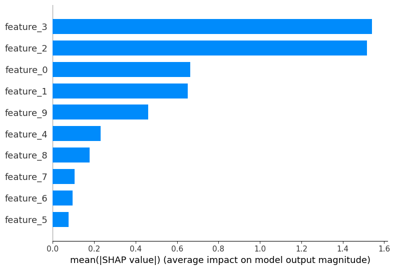
What it shows: An information-dense summary of how the top features impact the model globally.
How to read it:
- Y-Axis: Features are ranked by importance (sum of absolute SHAP values).
- X-Axis: The SHAP value.
7.2 The Beeswarm Plot (Global Feature Importance)
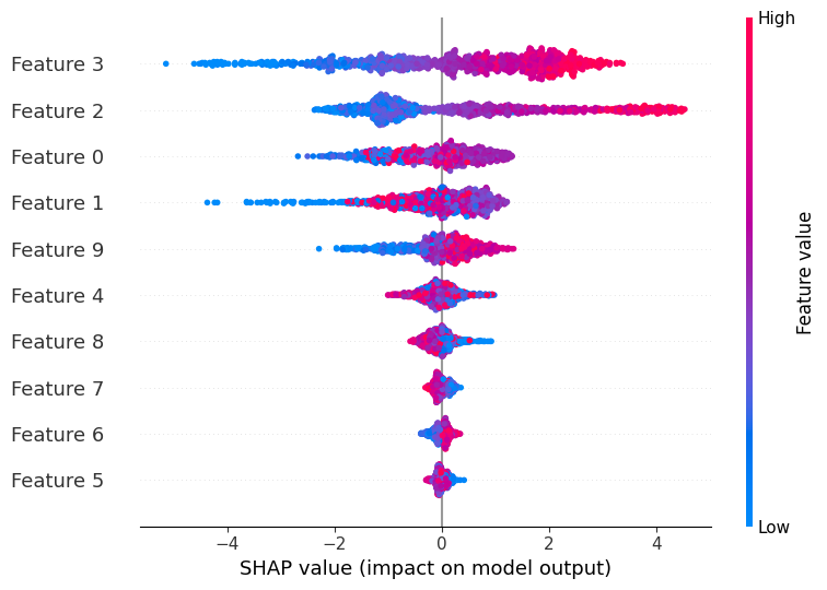
What it shows: An information-dense summary of how the top features impact the model globally.
How to read it:
- Y-Axis: Features are ranked by importance (sum of absolute SHAP values).
- X-Axis: The SHAP value. Points to the right increase the prediction; points to the left decrease it. In other words, the horizontal position of the dot indicates the impact of that feature on the model’s output, with dots to the right contributing positively and those to the left contributing negatively.
- Color: The actual feature value (Red = High, Blue = Low).
In the example above, notice the most important feature (feature 3). High values (Red) result in a positive SHAP value (dots on the right). This implies a direct relationship: as this feature increases, the model’s prediction increases. This single plot reveals both importance and directionality.
7.3 The Waterfall Plot (Local Explanation)
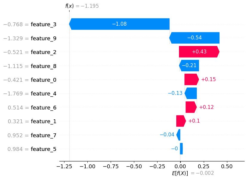
What it shows: A step-by-step breakdown of a single prediction.
How to read it:
- Start at the bottom with $E[f(X)]$ (the average prediction).
- Follow the bars up. Red bars push the score up; blue bars push the score down.
- The length of the bar is the SHAP value.
- The final value at the top is the actual model prediction $f(x)$.
This is the most effective plot for explaining a specific decision (e.g., “Why was my loan rejected?”). It shows cleanly that while Feature A helped you, Features B and C dragged your score down.
A similar plot is the decision plot (below), which shows how the prediction evolves as we add features one by one.
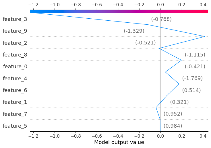
7.4 The Force Plot
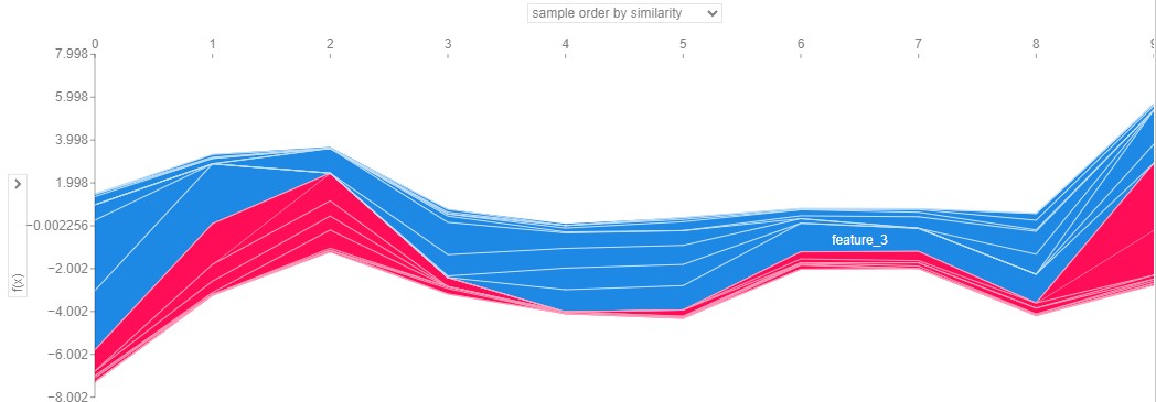
What it shows: The same information as the waterfall plot, but condensed into a single horizontal bar.
How to read it: It is a game of tug-of-war.
- Red forces push the prediction higher.
- Blue forces push the prediction lower.
- The meeting point is the final prediction.
Tip: These are great for stacking vertically to visualize how explanations change over time or across a dataset.
7.5 The Dependence Plot
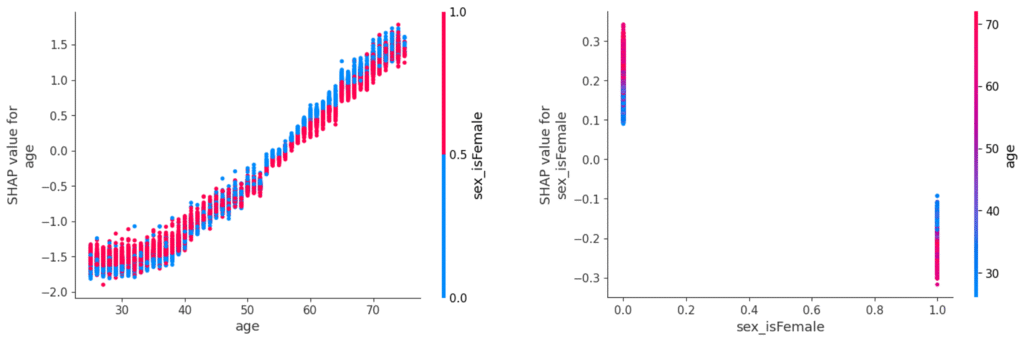
 What it shows: How a single feature’s value relates to its SHAP value across the dataset. In other words, it shows how changes in that feature affect the model’s output.
How to read it:
- The X-axis shows the actual feature value.
- The Y-axis shows the SHAP value for that feature.
- Color indicates the value of another feature (Red = High, Blue = Low).
- Trends in the plot reveal how changes in the feature affect the model’s output.
7.6 The Interaction Plot
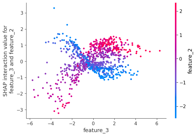
What it shows: How two features interact to change the prediction. Each point in the plot represents a SHAP interaction value for a specific pair of features, indicating how the combined effect of these features influences the model’s prediction.
How to read it: Similar to the dependence plot. Trends in the plot reveal how the interaction between the two features affects the model’s output.
7.7 Text and Image Explainers
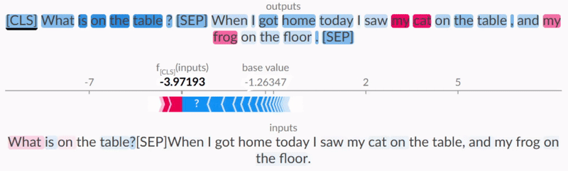
For NLP, SHAP highlights which words confuse or convince the model toward a specific class. Each highlighted segment is color-coded, with red indicating a positive contribution towards the predicted class and blue indicating a negative contribution. The intensity of the color reflects the magnitude of the contribution, allowing for quick identification of which parts of the text are most influential in shaping the model’s decision.
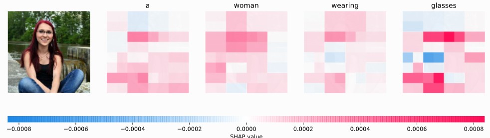
For Images, SHAP highlights the pixels (super-pixels) that drove the classification. Red pixels increased the probability of the class; blue pixels decreased it.
8. Best Practices
If SHAP is “how you distribute credit,” the background dataset is “the world you compare against.” Getting this wrong invalidates the entire explanation.
8.1 The Most Important Detail: The Baseline
The SHAP value is a measure of deviation from a baseline (background data). If your baseline is the average of the entire dataset, you are explaining: “Why is this prediction different from the average?”
- Recommendation: Use a representative sample of your training data (e.g., K-Means cluster centers or a random sample of 100-500 rows).
- Warning: Do not use a single zero-vector unless zero has a specific semantic meaning (like “grey” in images).
8.2 Classification outputs: Probability vs. Log-Odds
For classification models, most SHAP explainers (like TreeExplainer) work in the log-odds (logit) space by default, not probability space.
This is because log-odds are additive ($A + B = C$), whereas probabilities are bounded between 0 and 1 and cannot simply be added.
- The Trap: Users try to sum the SHAP values and expect them to equal the probability output (e.g., 0.8). Instead, they sum to the logit (e.g., 1.38).
- The Fix: Check your explainer’s
model_outputparameter. If you need probability space, understand that additivity guarantees might loosen or interpretation becomes harder.
8.3 Handling Correlated Features
When two features are highly correlated (e.g., feature_A and feature_B are practically identical), SHAP will split the credit between them.
If your model ignores feature_A and uses feature_B entirely, TreeSHAP might still assign credit to feature_A if the “Conditional” path is used, or KernelSHAP might split it exactly 50/50.
- Tip: If you see unstable SHAP values where importance oscillates between two features across different runs, you likely have multicollinearity. Consider grouping these features or removing one before training.
8.4 Leakage and Proxy Features
SHAP is excellent at revealing data leakage and proxy features. Because SHAP faithfully attributes credit to whatever the model uses, it acts as a lie detector for your feature engineering.
Be cautious of two common patterns:
- The “Too Good to Be True” Feature: If a single feature completely dominates the SHAP summary plot in both training and testing, it is often a sign of leakage. For instance, including a “cancellation_date” feature when predicting churn will result in massive SHAP values, revealing that the model is “cheating” by looking into the future.
- Timestamp Proxies: Sometimes a timestamp or index feature becomes a top predictor merely because the target concept is drifting over time. SHAP will expose this by assigning high importance to the time feature, warning you that the model is memorizing when things happen rather than learning why they happen.
8.5 Best practices checklist (production-oriented)
- Decide the question first: explanation for an individual decision, or monitoring global drivers.
- Select the explainer for your model class: TreeSHAP for trees; KernelSHAP for black-box.
- Choose the background intentionally: representative, stable, and documented.
- Validate additivity: check $\phi_0 + \sum_i \phi_i \approx f(x)$.
- Test stability: vary random seed/background sample; verify top drivers remain consistent.
- Treat SHAP as model explanation, not causal proof: pair with domain knowledge and (if needed) causal analysis.
- Monitor over time: track aggregate SHAP importance and drift by segment.
Summary
SHAP has become the industry standard for model interpretability because it combines theoretical rigor (Shapley values) with practical utility (efficient algorithms like TreeSHAP).
However, it is not a magic wand. It explains the model, not necessarily the causal reality of the world. It tells you that “The model relied heavily on Zip Code to predict Price,” not necessarily that “Changing the Zip Code serves as a causal mechanism to change the Price.”
Used correctly, it bridges the gap between the black box and the human decision-maker, transforming a raw score into a justified, transparent decision.

Happy is a seasoned ML professional with over 15 years of experience. His expertise spans various domains, including Computer Vision, Natural Language Processing (NLP), and Time Series analysis. He holds a PhD in Machine Learning from IIT Kharagpur and has furthered his research with postdoctoral experience at INRIA-Sophia Antipolis, France. Happy has a proven track record of delivering impactful ML solutions to clients.
Subscribe to our newsletter!